-
search
And error occurred! Please, try again.
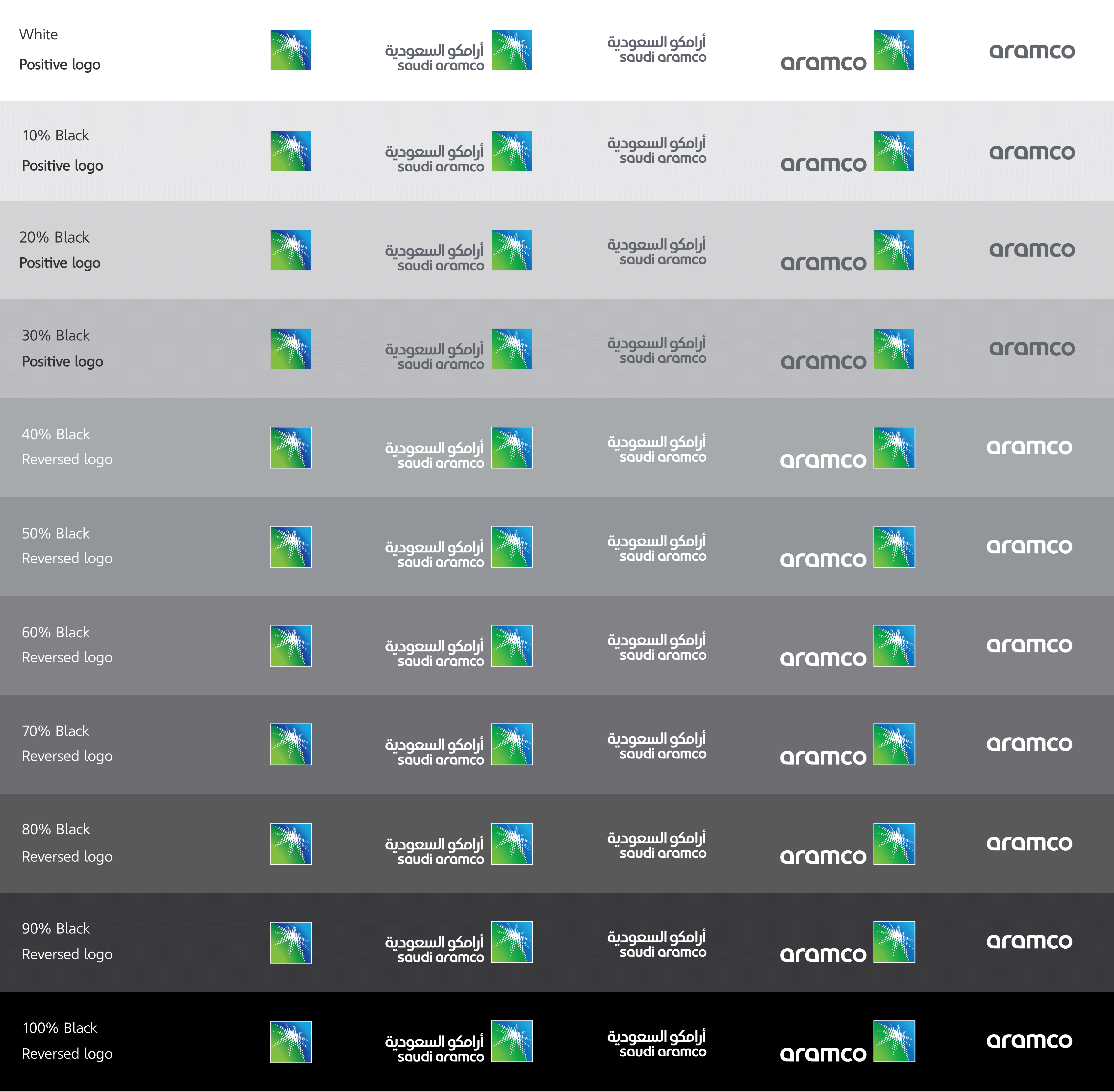
Our logos always need to be legible for recognition. In our visual identity, we use a range of images and backgrounds against which our logos need to stand out. To ensure this is possible, each of our logos has positive and reverse versions. When placing a logo on an image, compare its lightness with the appropriate column below to choose correct version.
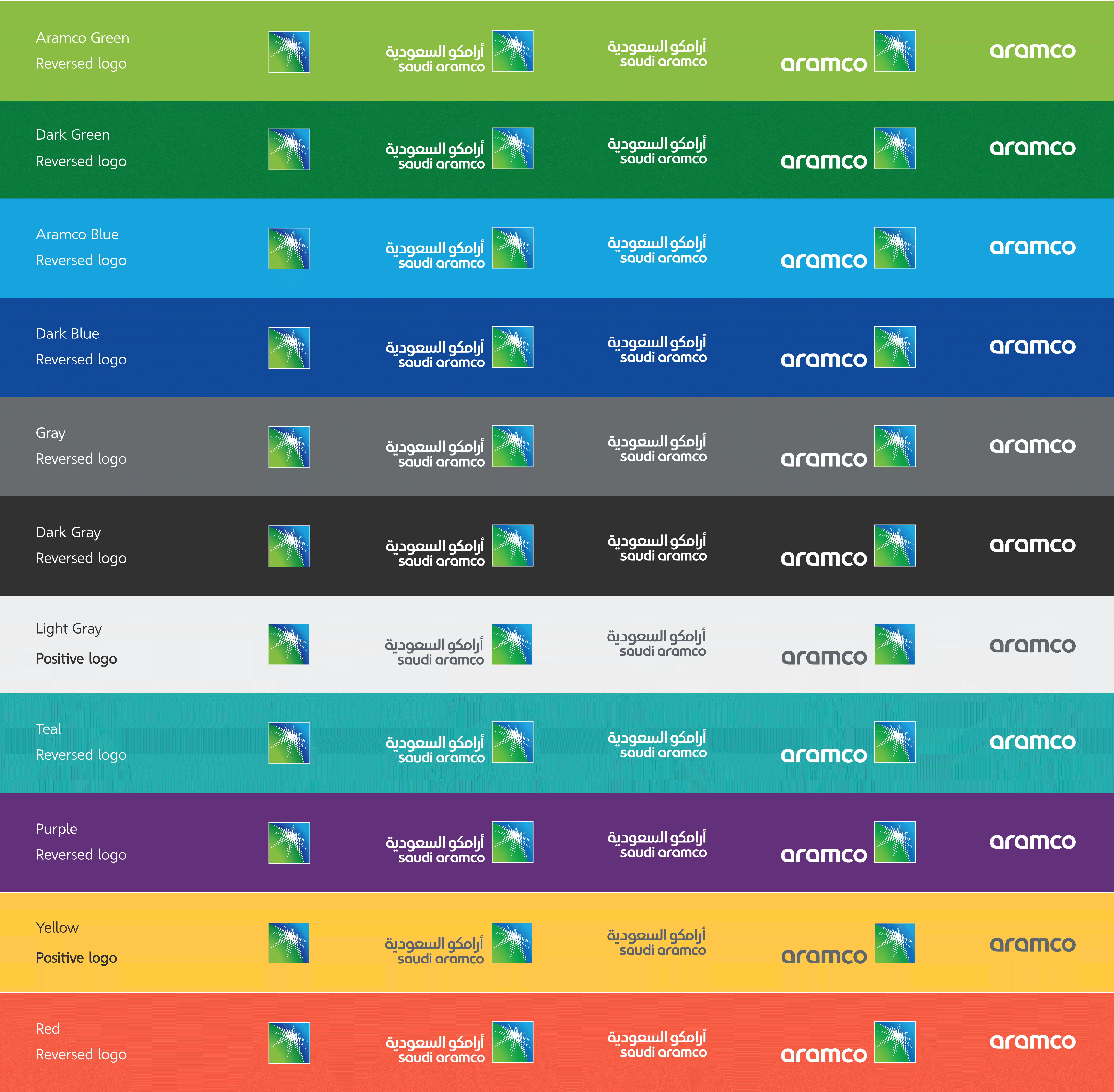
When any Aramco logos are placed on our brand colors, the reverse version should be used, except for yellow, white or light gray backgrounds.
Our logo is our most recognizable brand identifier. It conveys our core essence. Every part of our logo has been specifically designed and constructed. It must never be altered.

