-
search
And error occurred! Please, try again.


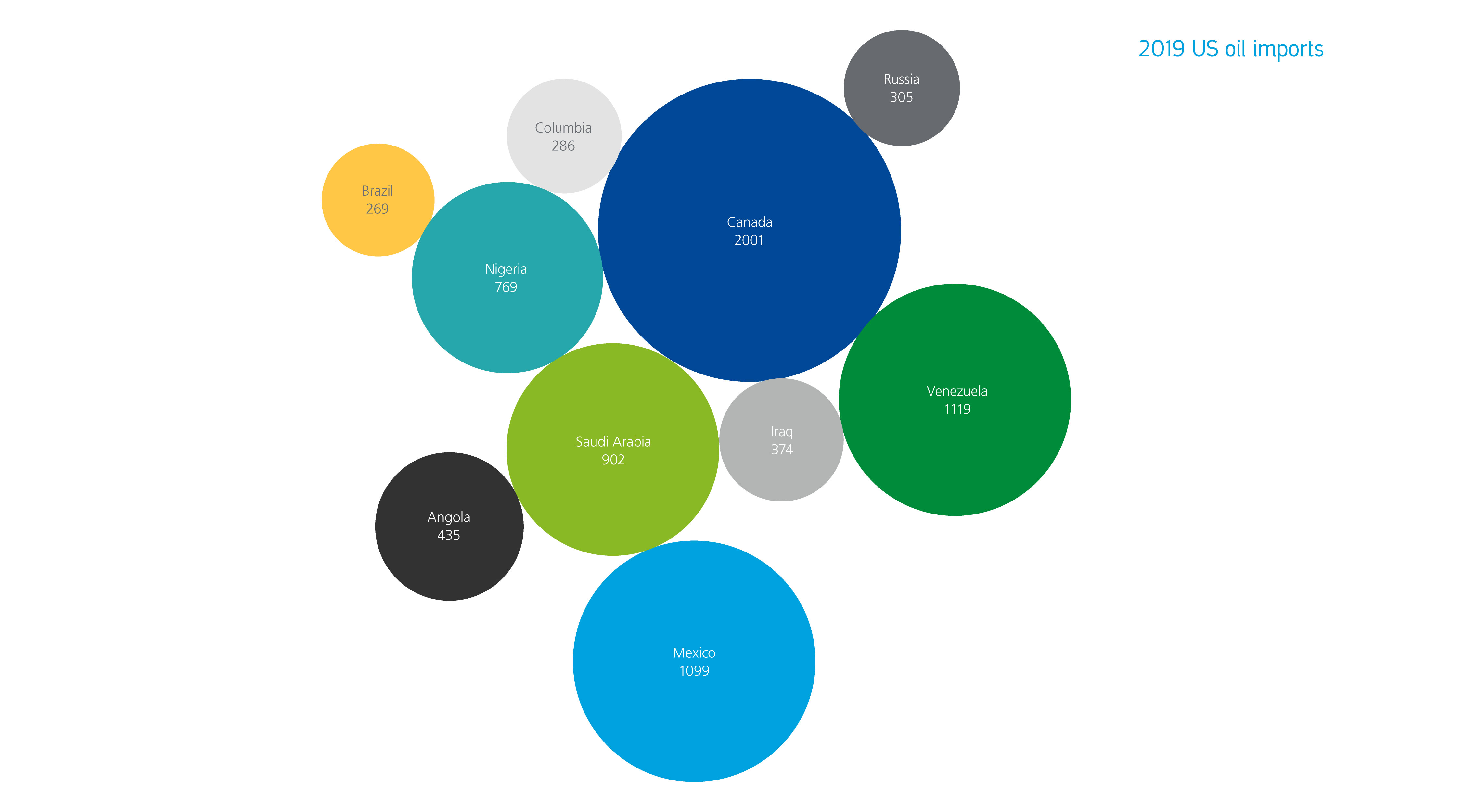
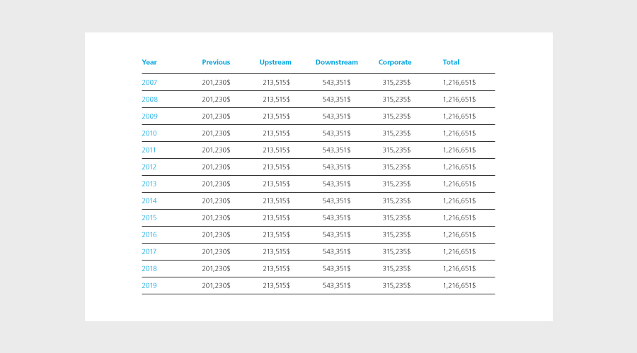
We categorize our data and information into four types; Charts and graphs; Diagrams; Tables and numbers; Infographics. Each takes the identity assets where needed, and extends them to communicate information in engaging and effective ways.
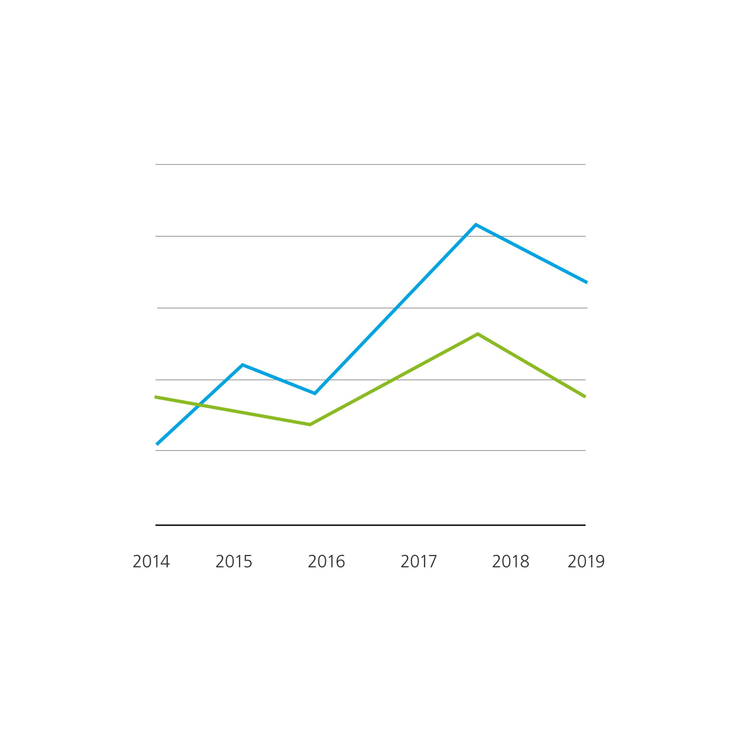


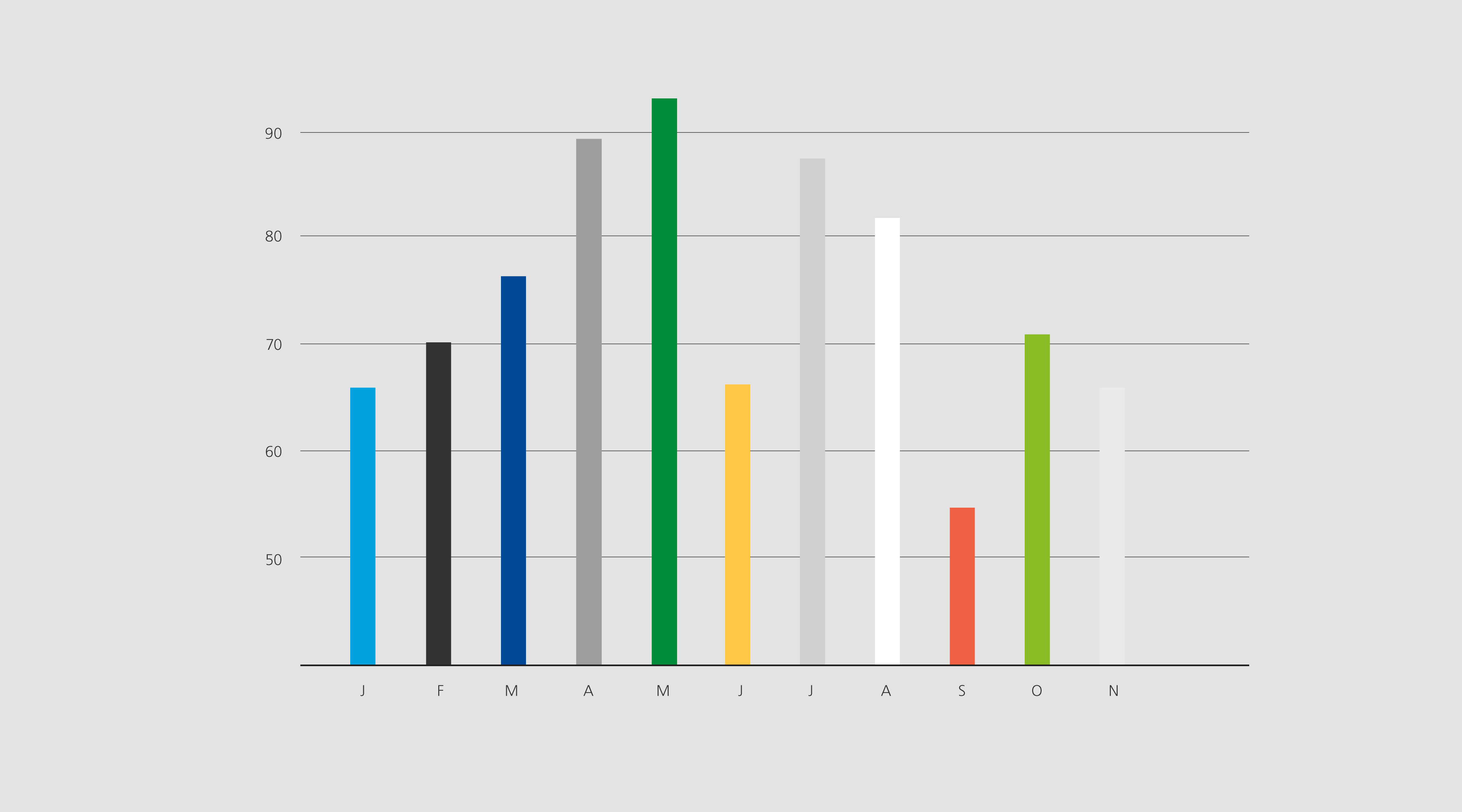
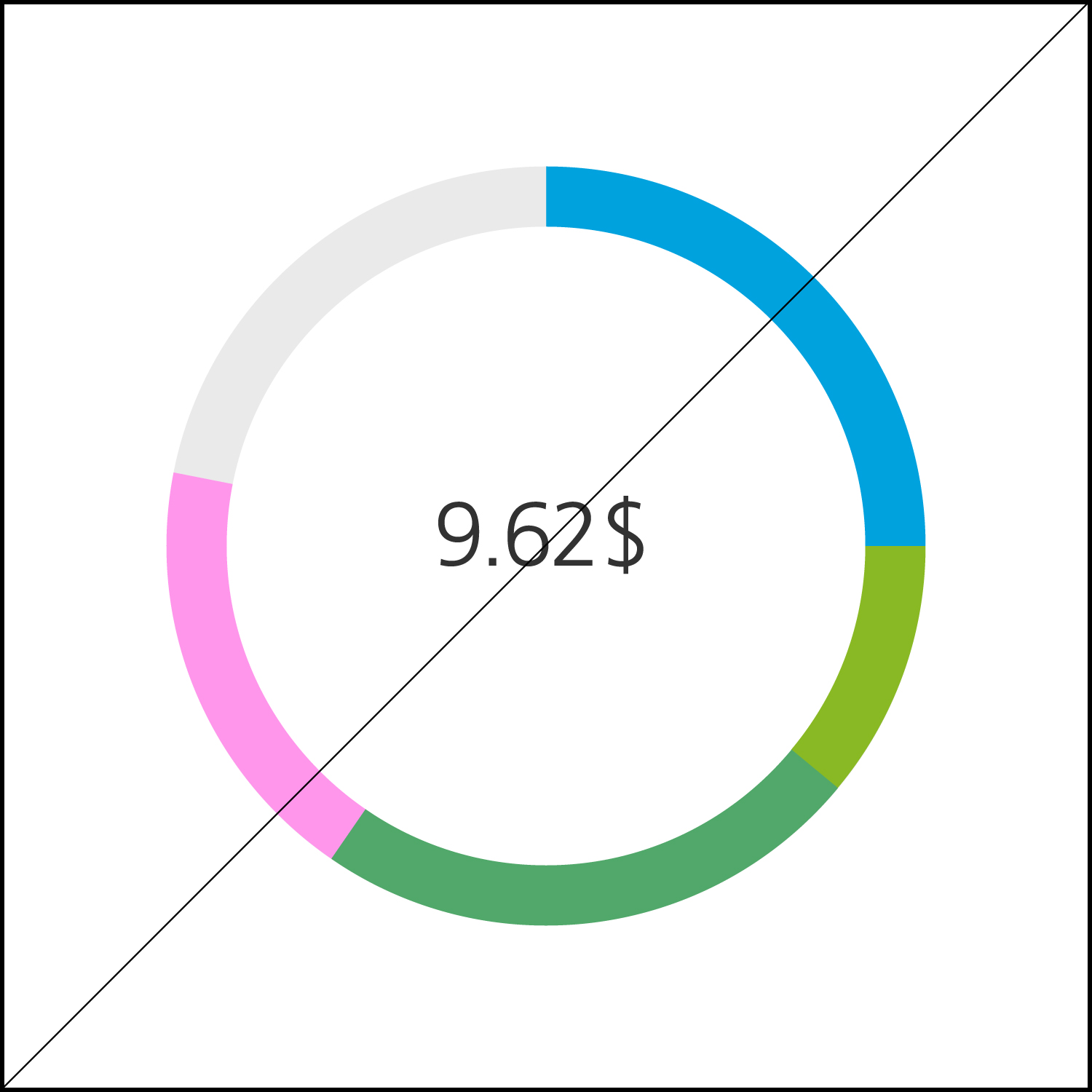
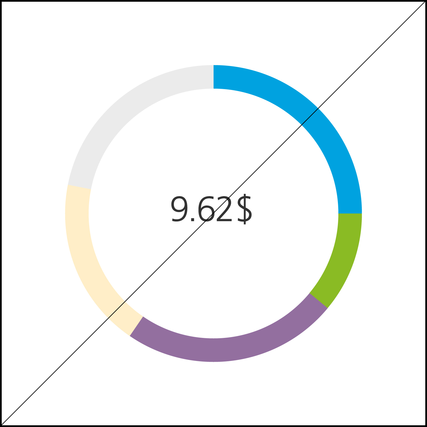
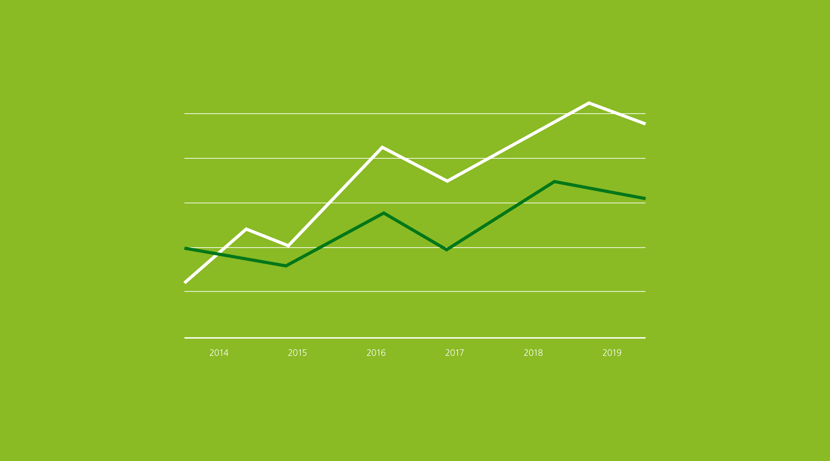
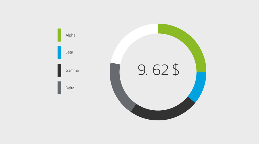
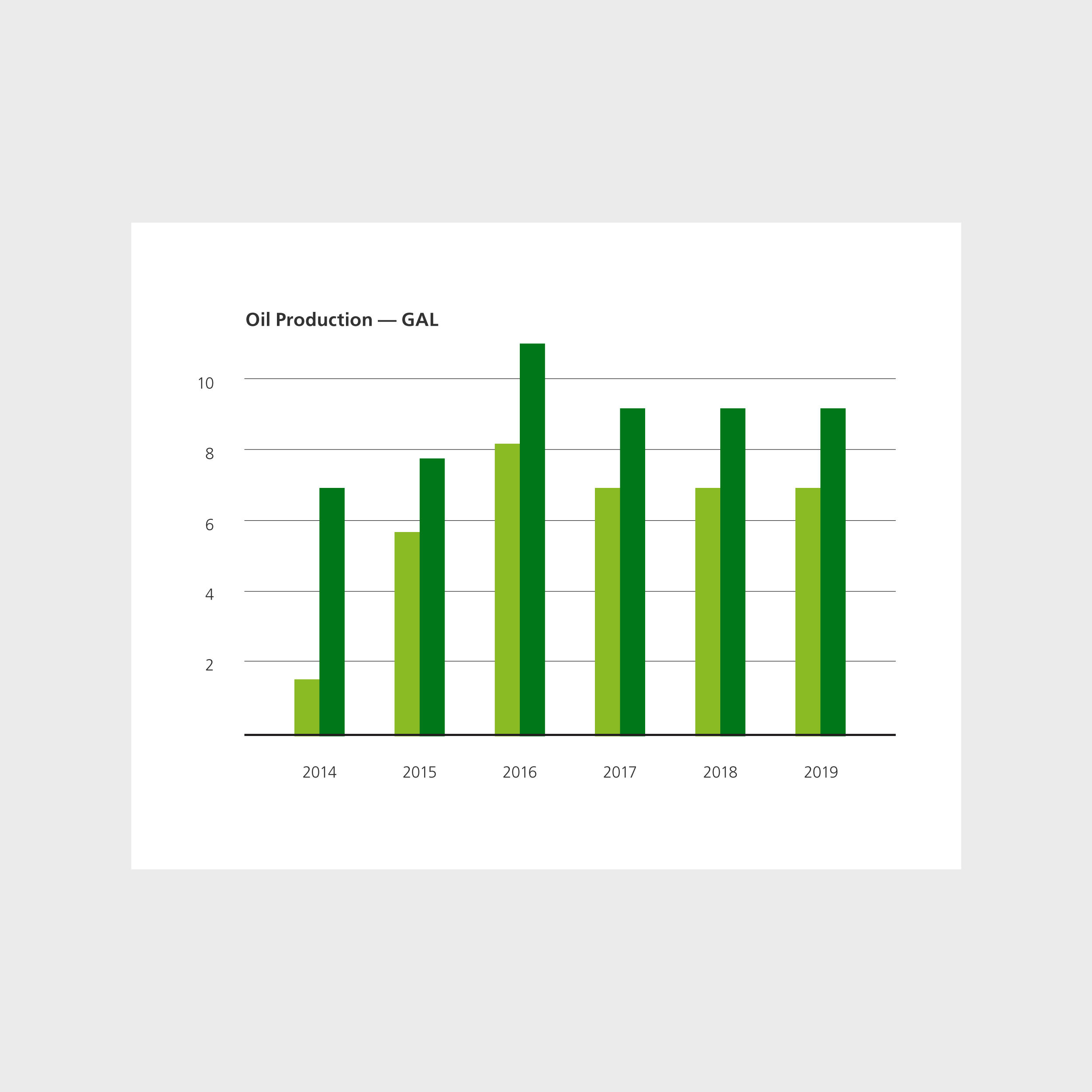
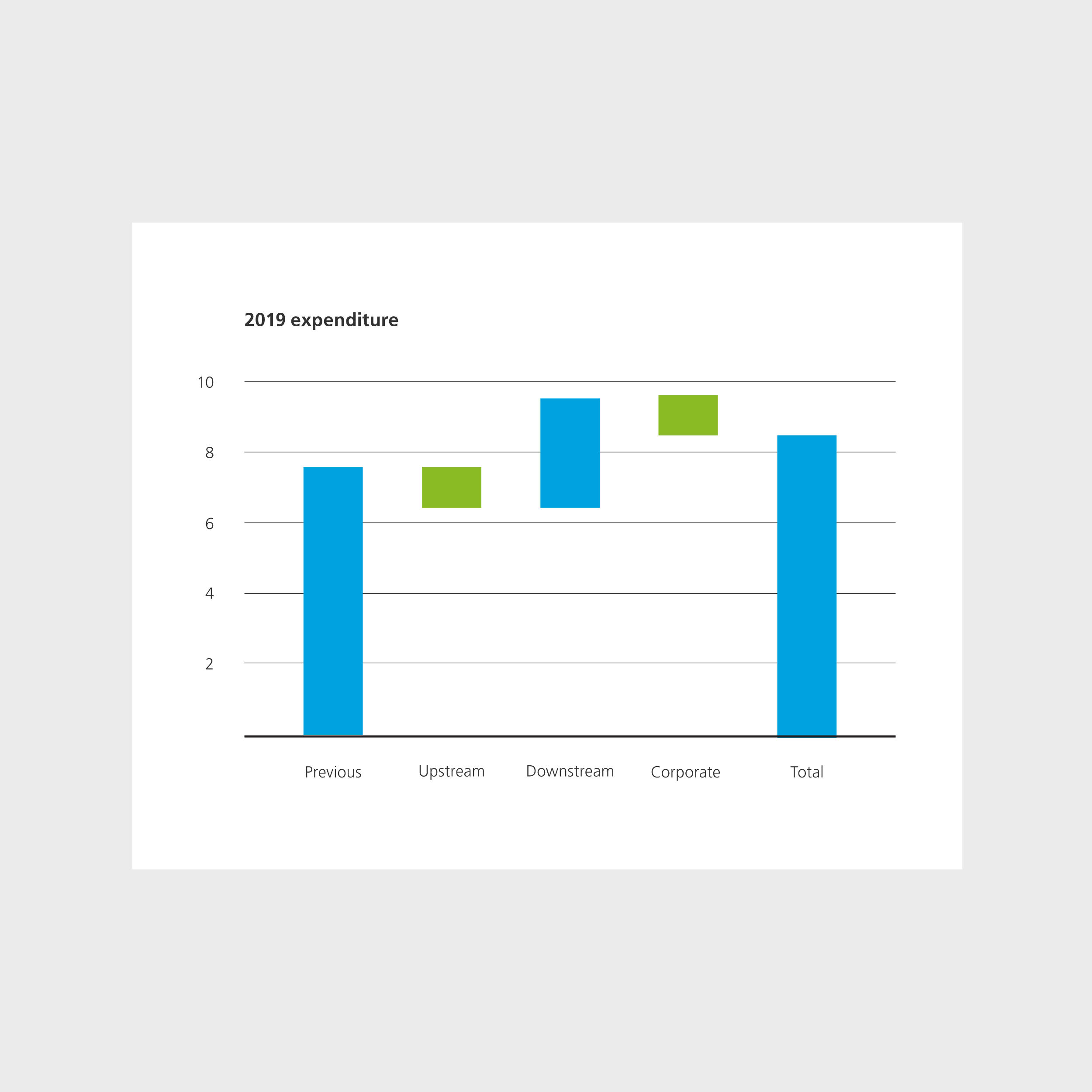
Bar and line graphs should be used to create data that covers a period of time. Pie charts are used when showing percentages or proportional data. Both use the Aramco primary color palette.
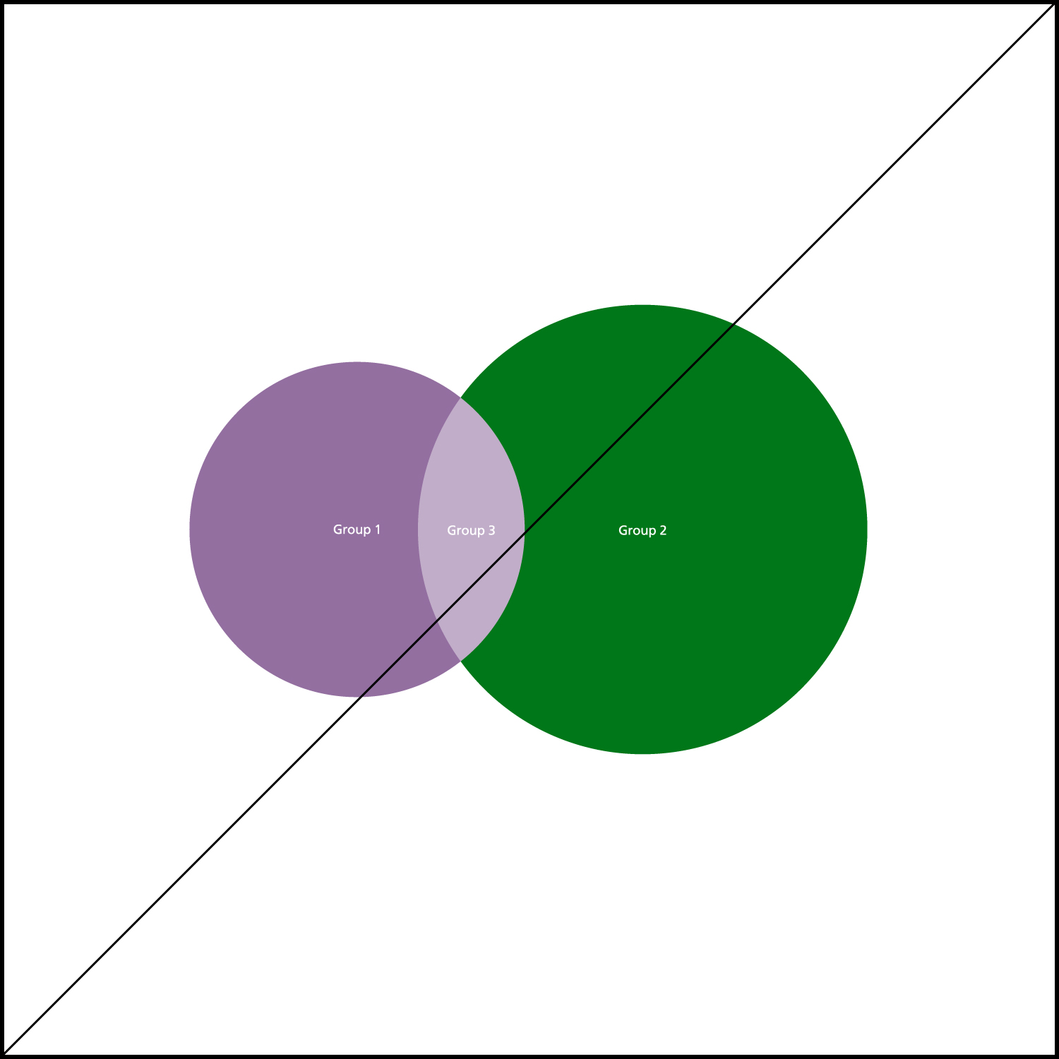
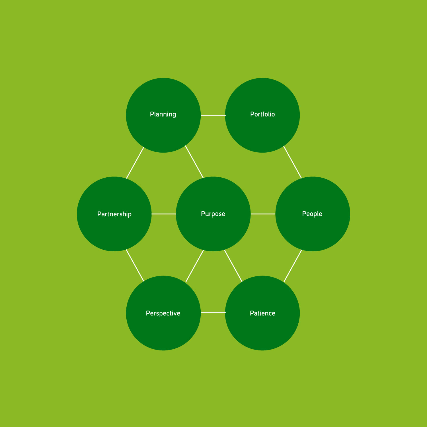
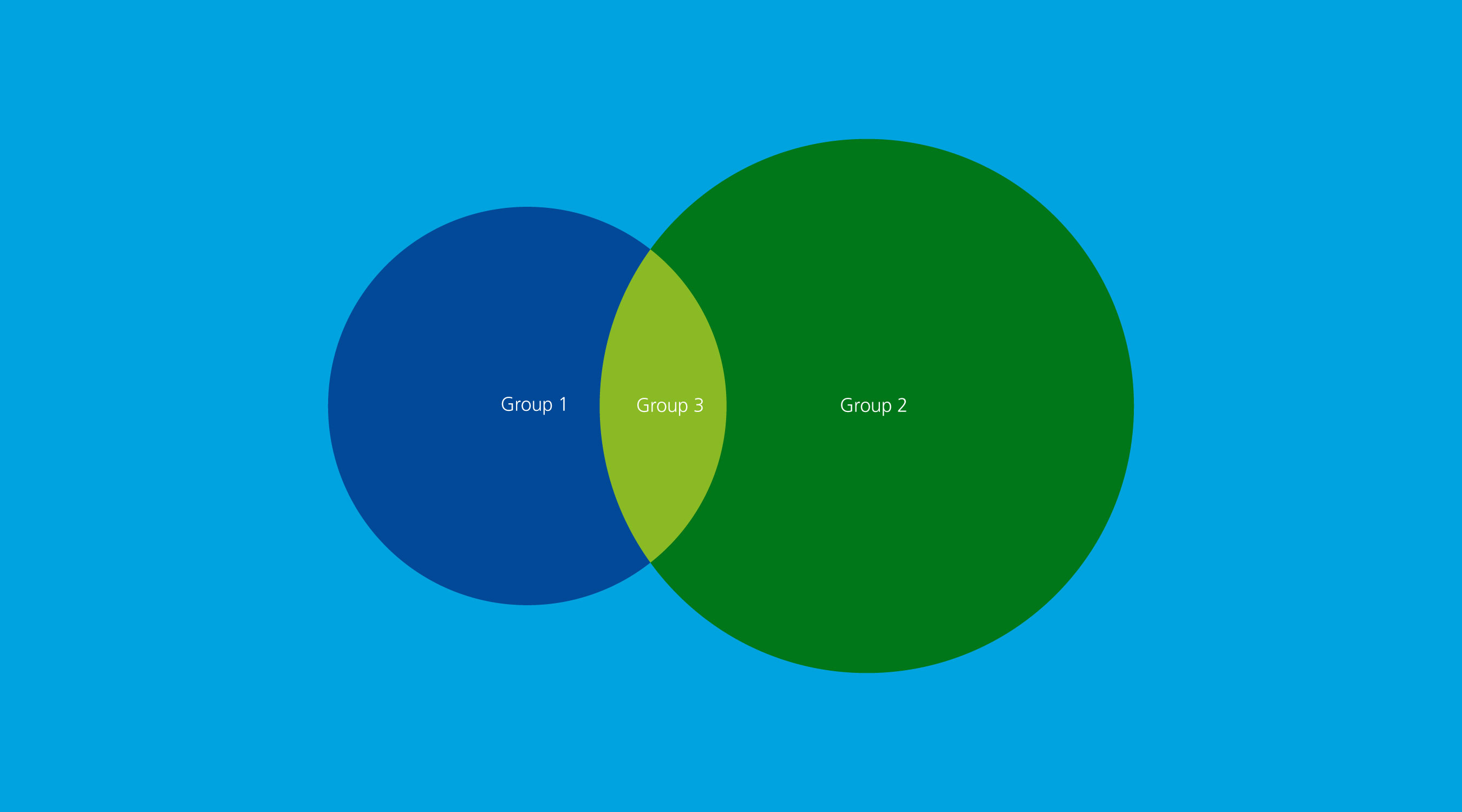
Diagrams cover a wide range of data visualization. They should be created using simple bold shapes.

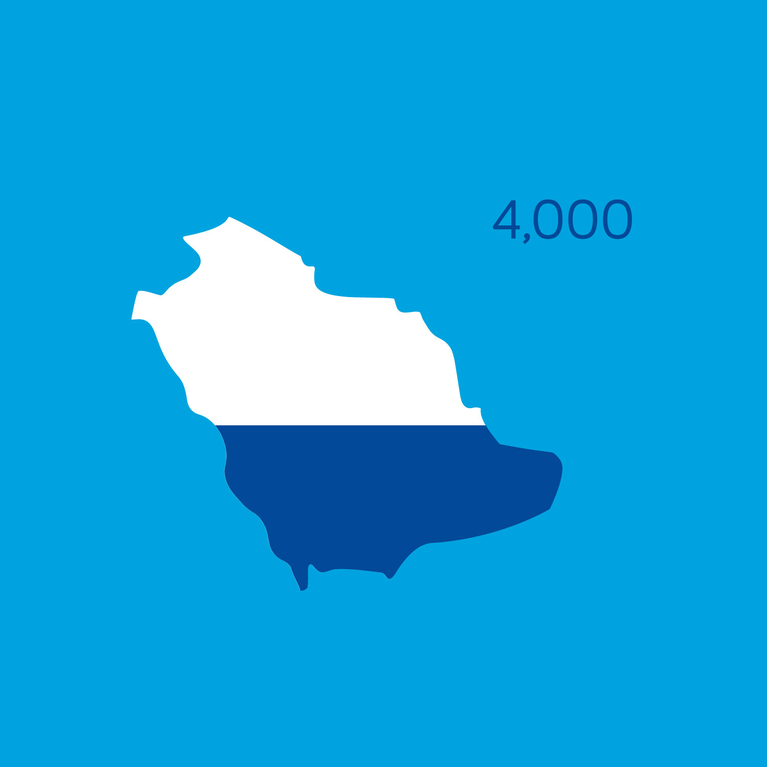
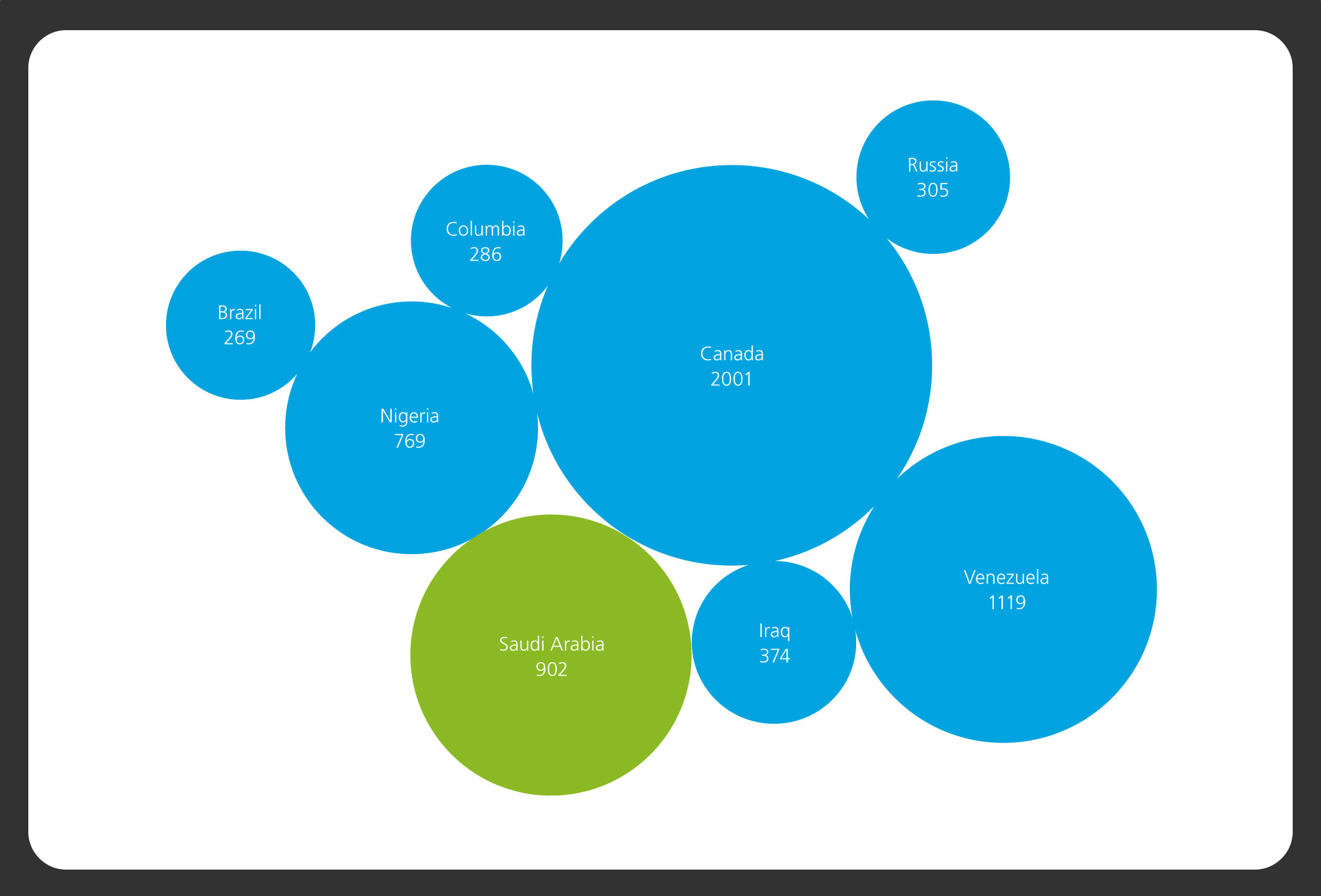
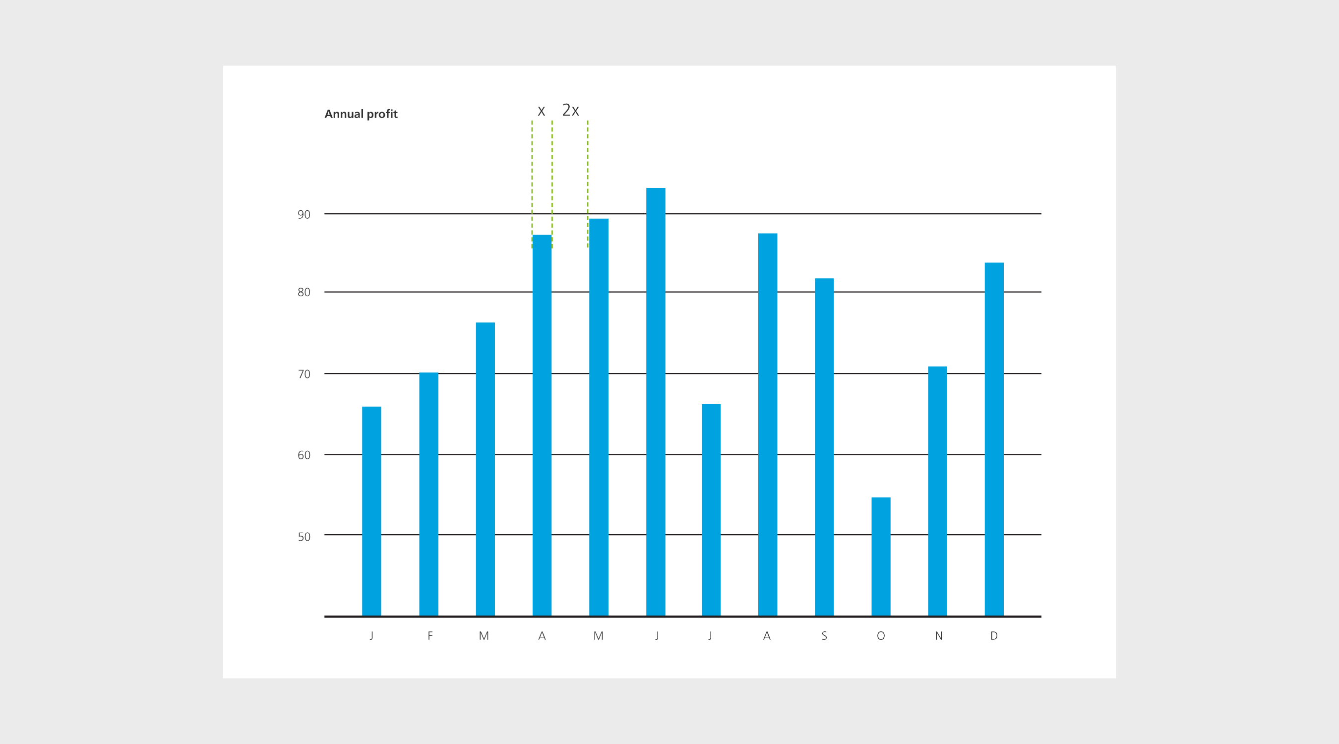
Key facts and figures should be highlighted when appropriate. This can be achieved through scale and size. This should be done using the Aramco primary colors.

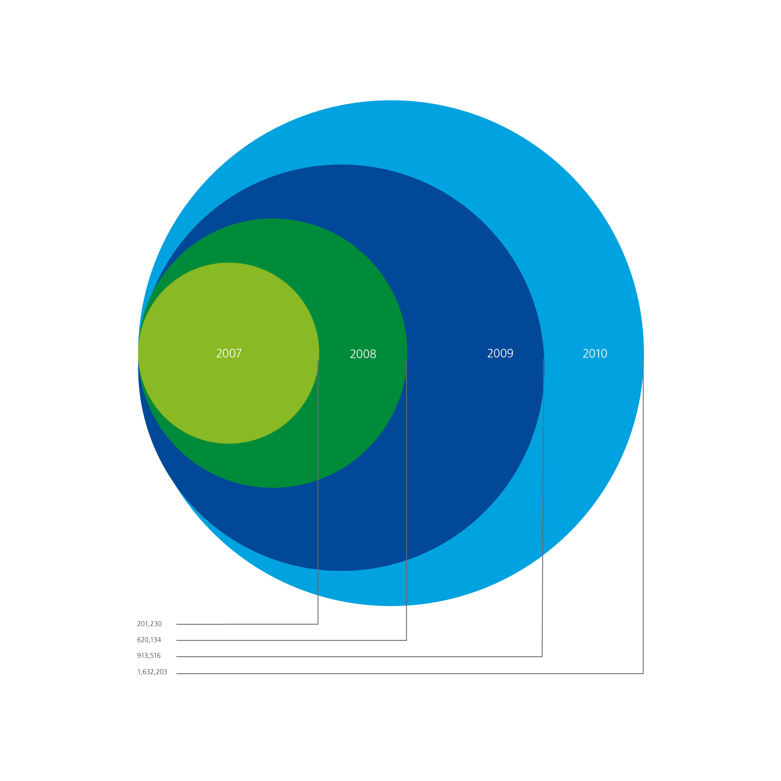
The Aramco illustration style can be used to create info-graphics with a sense of scale that is easy to understand. Using flat color complements our illustration style.


Our secondary color palette can be used if more colors are needed to represent multiple pieces of information.