Outlines
External use
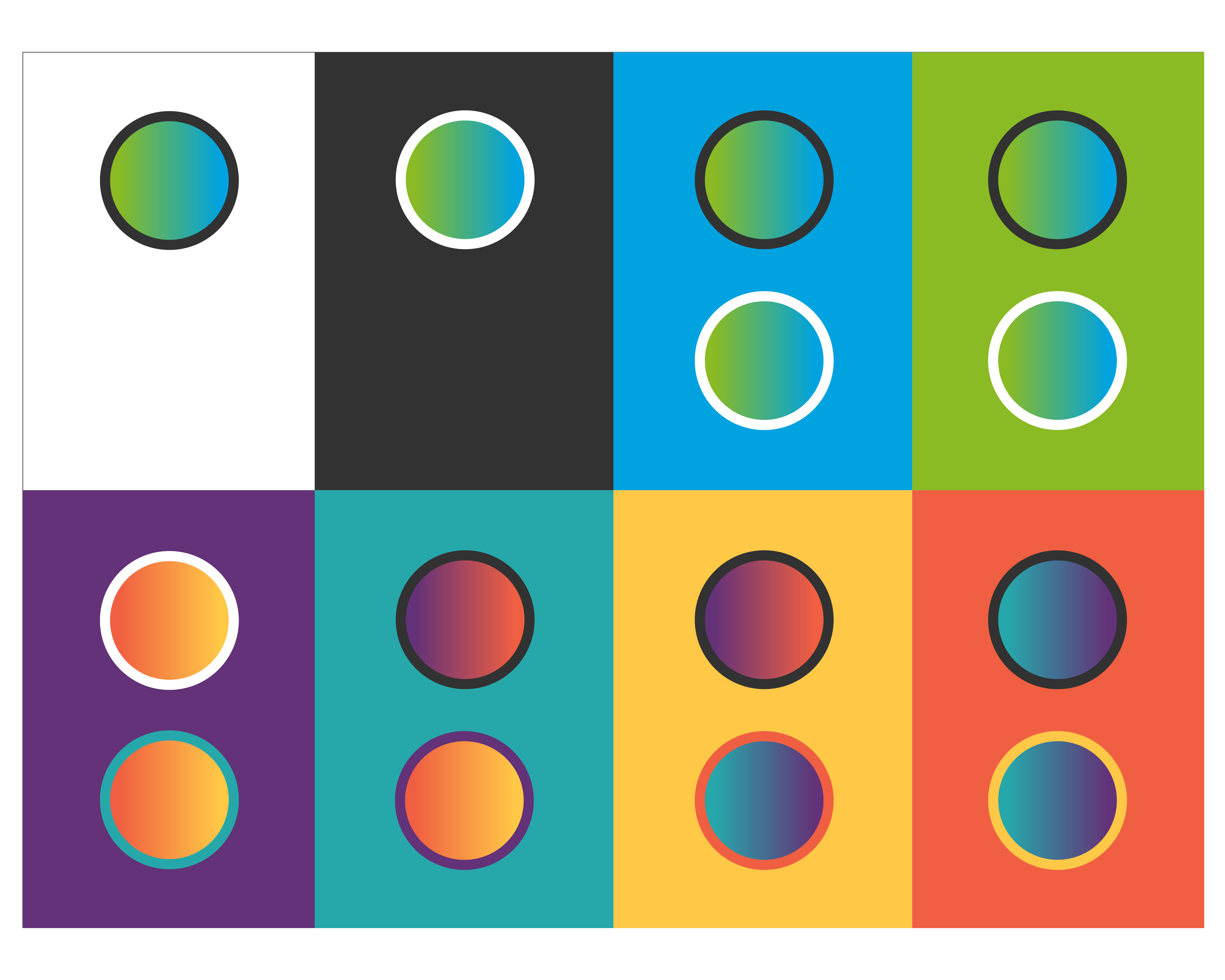
For external communications, the energy element is used with the green-blue gradient. Backgrounds can be White, Green, Blue, or Gray.
Internal use
For internal communications, the energy element used with the gradients made from secondary colors.
Gradients
Aramco uses four gradients within an illustration. For the correct usage of gradients, check out the Colors section. Secondary gradients are for internal use only.
Colors
External combinations
Illustrations can be on White, Green, Gray, or Blue backgrounds, and have one or two options for line color and gradient, depending on the background.
Internal combinations
Internally, backgrounds for illustrations can be Purple, Yellow, Teal or Red. Depending on the background chosen, there are two options for how the line and gradient can be colored.
Principles
Photographic excellence in lighting, composition, and resolution reflects our status as a technology leader.

Use internal colors for internal illustration.

Use external colors for internal illustration.

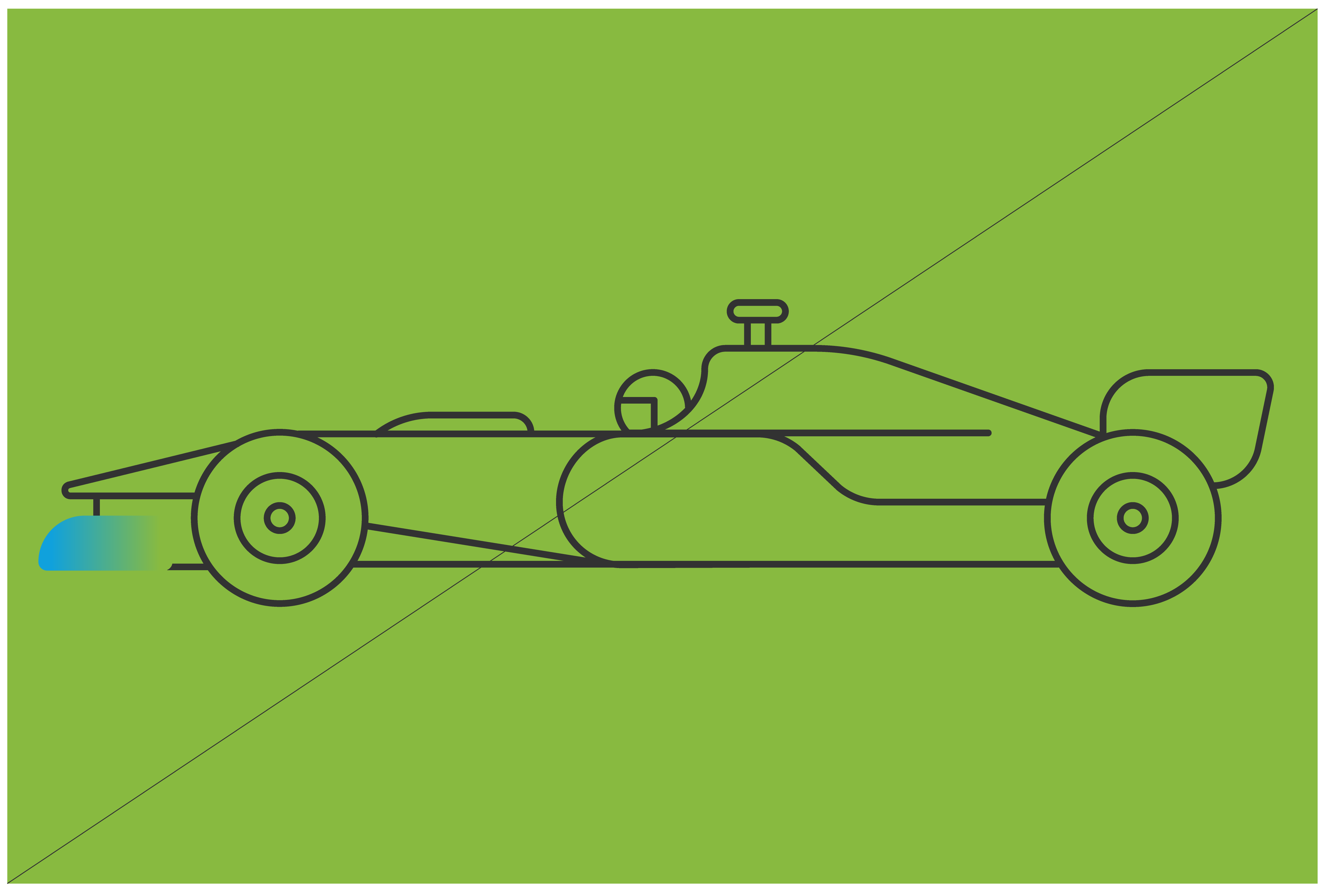
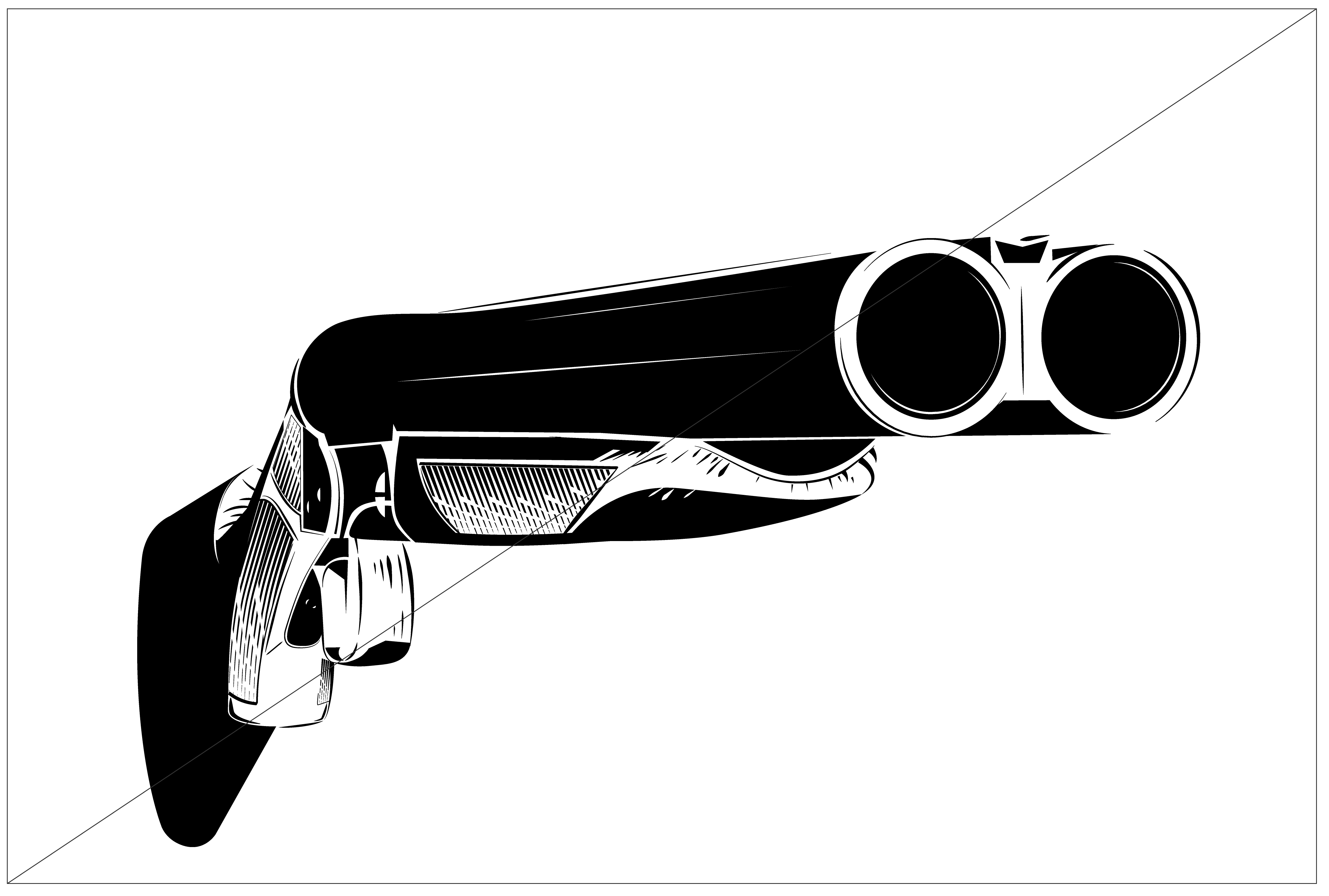
Lines have rounded terminals and corners.

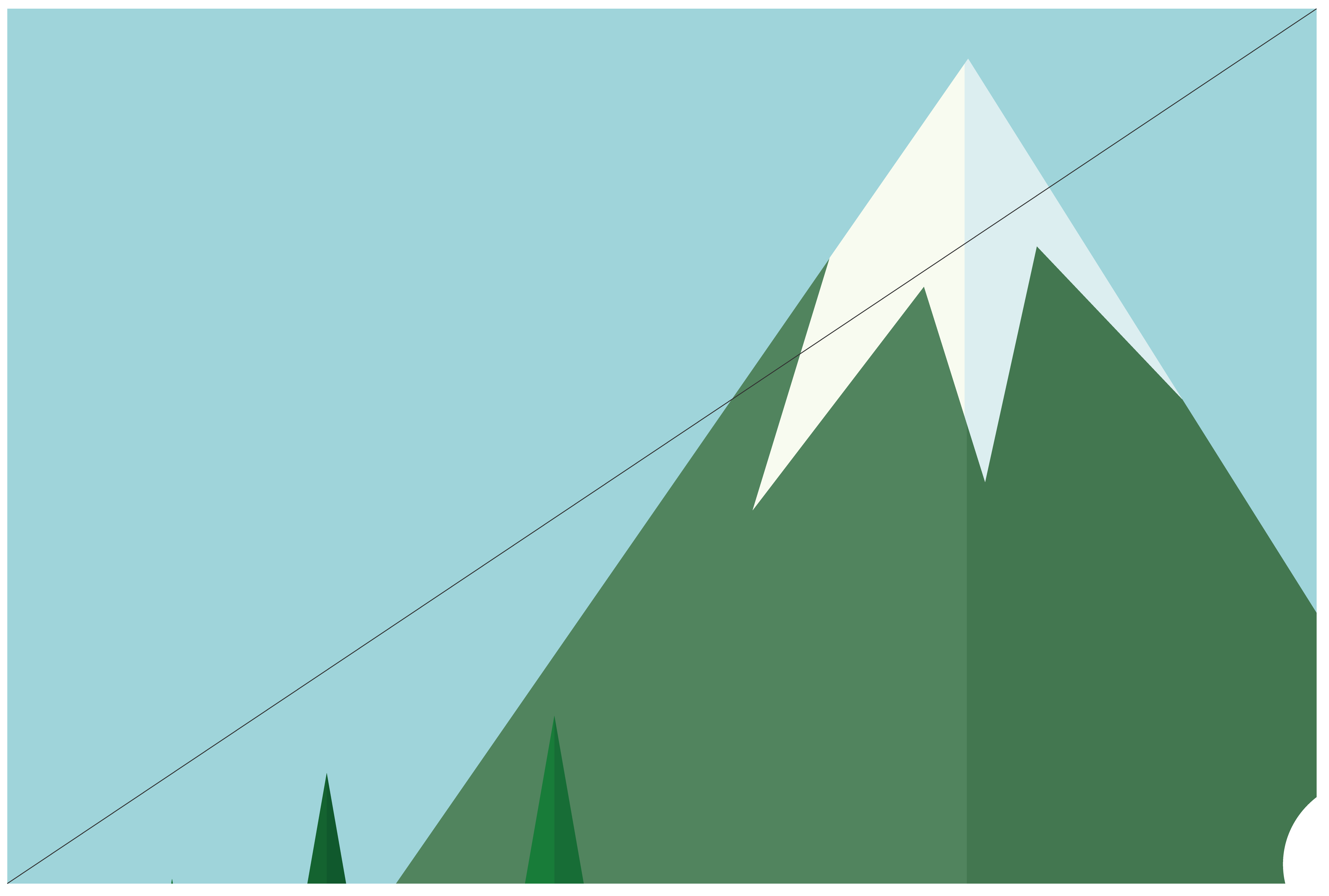
The energy element is included in every illustration only once. It is used to highlight a relevant or active part of a scene.
Use the color combinations that are provided.

The stroke color must be different to the headline color.

On a colored background, the energy element should have a stroke around it that is the same color and weight as the other lines in the illustration.

The energy element can curve and bend, but must be uniform. Its terminals should be straight-edged to contrast with the rest of the illustration.
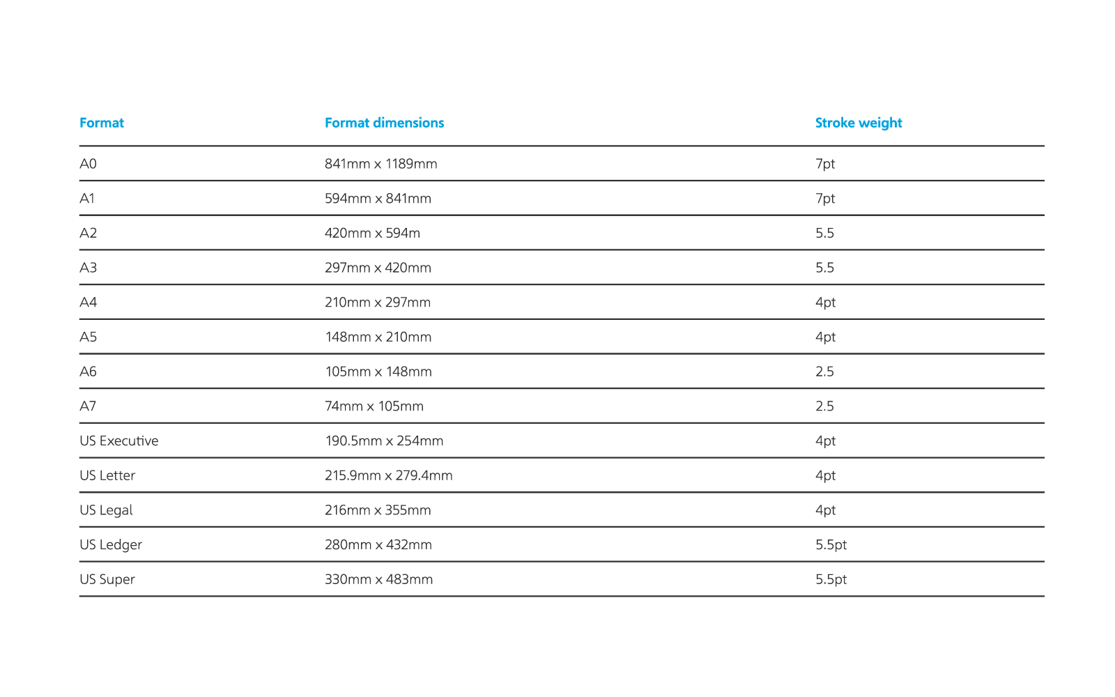
Illustration stroke width
The Illustration stroke width is determined by the format size
Things to avoid

Don’t use multiple stroke weights in a illustration.
Don’t use internal colors for external illustration.

Don’t use straight corner edges.

Don’t create an illustration without the energy line.

Don’t change the color combinations that are provided.

Don’t use the same color for the illustration and the headline.
Don’t use an energy element without a stroke around it on a colored background.

Don’t warp the energy element.
Additional styles - Principles
The development of other illustrations styles , 3D, and the use of Image Bank are allowed, but it should always be reviewed and approved by Corporate Identity reviewers before publishing. Below, are basic principles that should be considered.
Avoid using sharp edges; instead always go for round, soft shapes.

Avoid using comic styles.

Don’t use illustrations without purpose and connection with the brand.

Avoid using caricature styles.

The basic colors should be taken from the primary and secondary palette. Other colors are allowed to create more realism, but only when necessary.
Avoid violence scenes.

Don’t use icons as illustrations

Avoid culturally sensitive scenes.