search clear
Filter by Categories
Filter by File Type
And error occurred! Please, try again.

Wordmark arrow_forward

Updated: 12/26/2021 link

Introduction

The use of the wordmark as a graphical element has two objectives: establishing a closer relationship with the viewer, and reinforcing Aramco’s brand name. Our wordmark is the primary graphic element to be used on different visual communications; it extends the visual language of the brand. It is a custom-designed fixed element that combines unique characters with solid strong forms.

Full wordmark

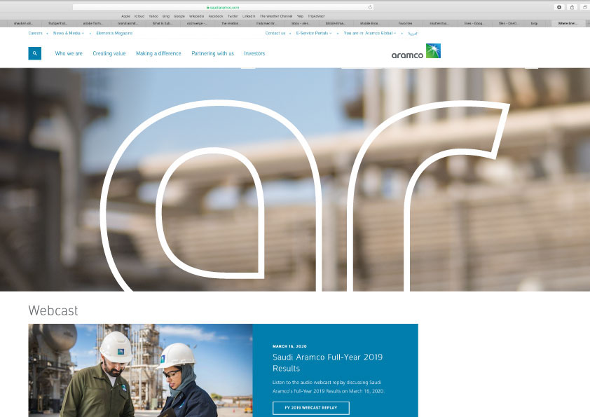
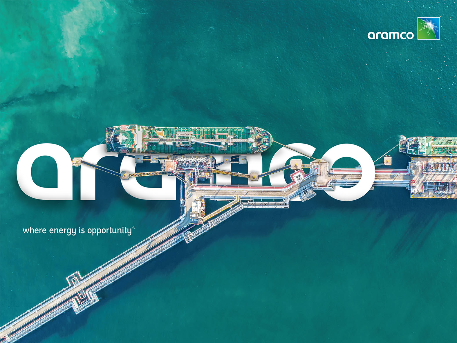
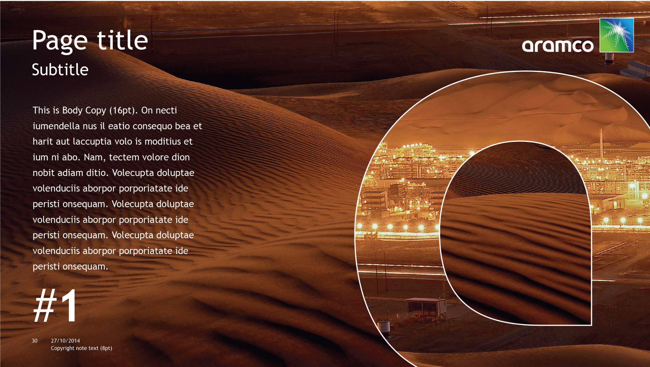
Designed to be used externally or internally for maximum brand impact.

Full wordmark principles
The full wordmark should interact with elements of the picture, and must be used only in White or Dark Gray
The cropped wordmark can be used with the primary color.
Full wordmark rules

The full wordmark can be cropped to interact with pictures. The following is a cropping formula that will guide you to the correctly crop space. Be sure to send to Corporate Identity reviewers before submitting final work.

Option 1

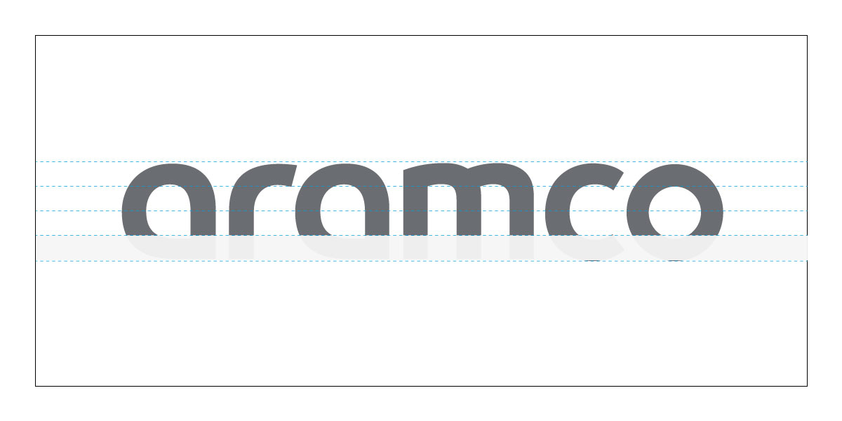
Cropping the wordmark from the bottom is allowed up to maximum of 25%.

Option 2

Cropping up to 25% of the letter (a) and the end of letter (o). Cropping must be applied on both sides (right & left)

Watch Video
Learn how to apply full wordmark rules.

Partial wordmark

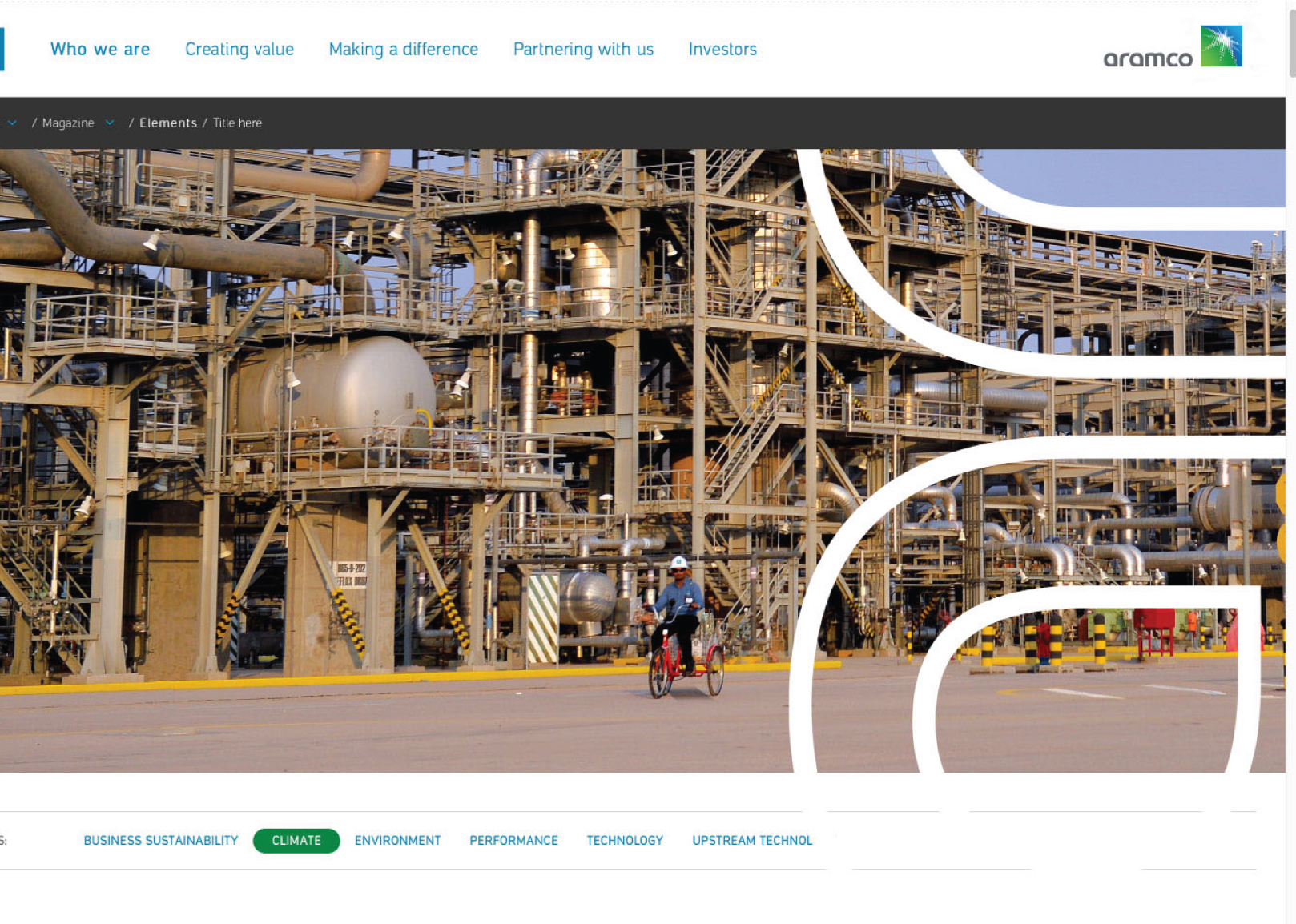
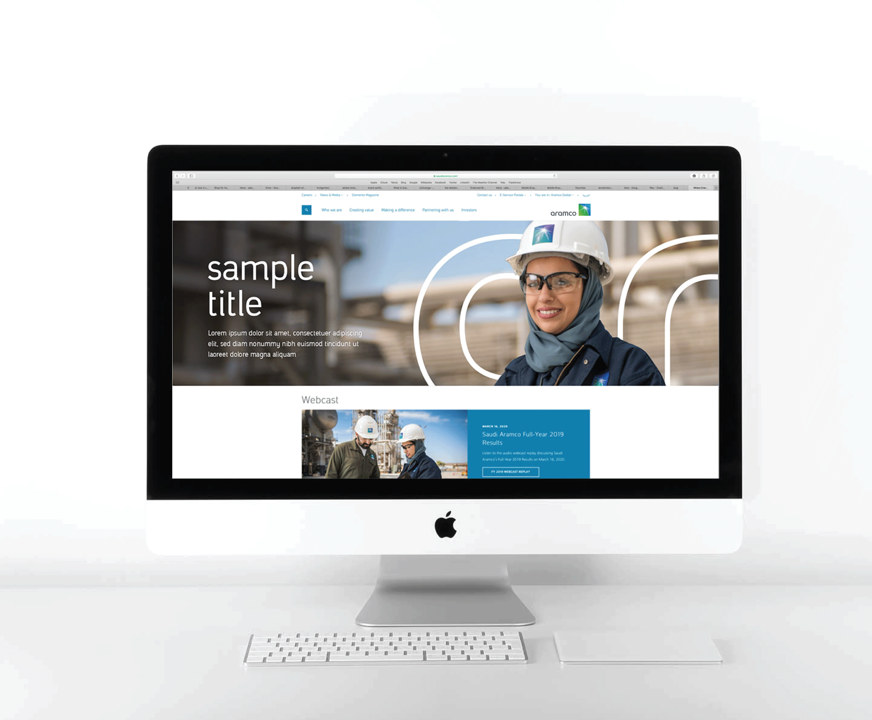
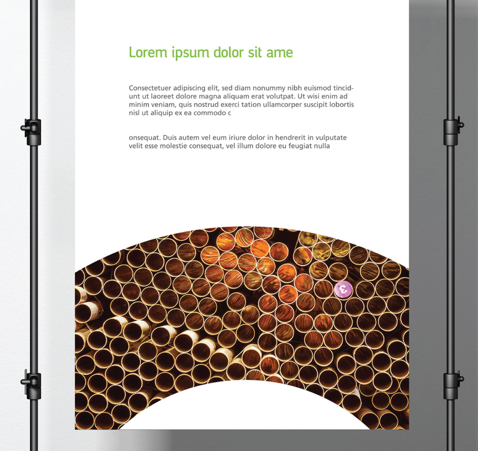
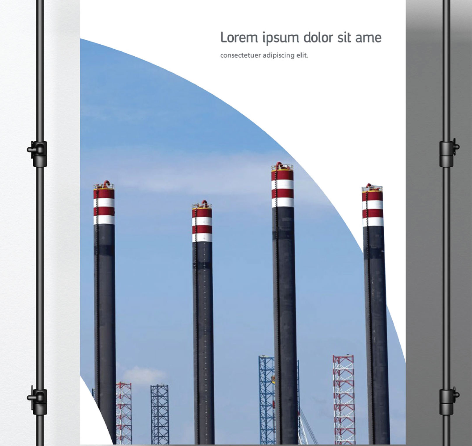
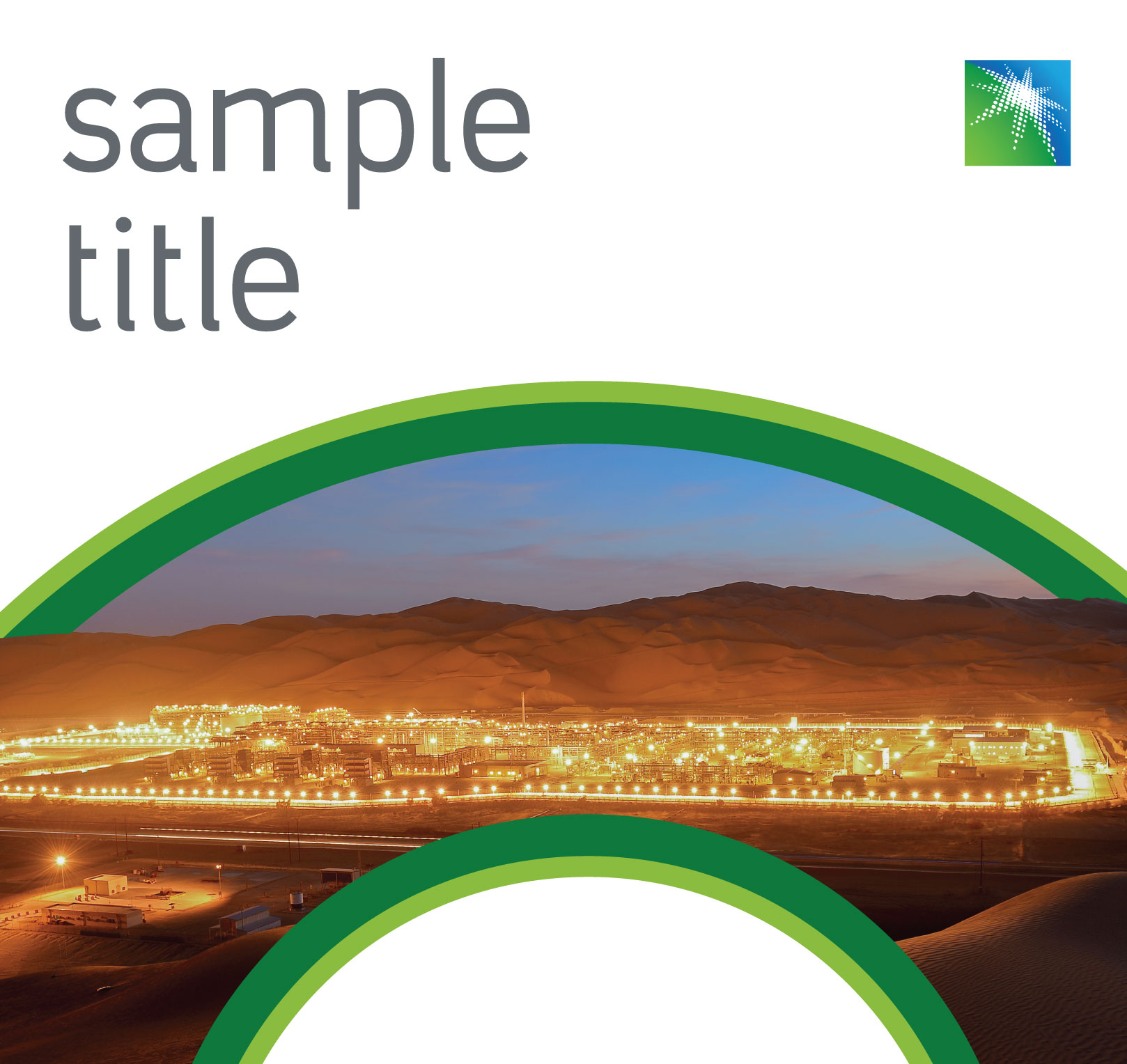
Used externally when our logo is visible, or internally. This category is designed focus certain subjects while maintaining brand visibility.

Partial wordmark principles
Only partial and window wordmarks can be used in the outline version.
The partial wordmark should be used with 2, 3 or 4 letters.
The partial use of wordmark should interact with elements of the picture.
The partial use of wordmark should be only outlined in White or Dark Gray -depending on the background-.
When pictures and illustration are not present, mixing all formats are allowed and the partial use of wordmark can be filled with one of our primary colors.
Partial wordmark rules

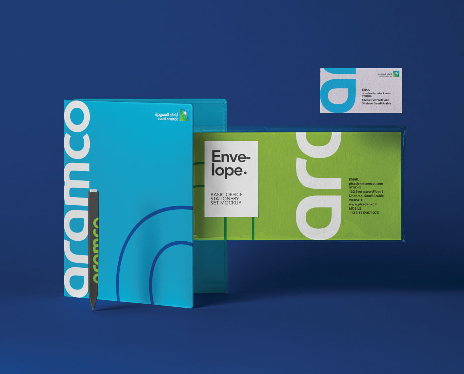
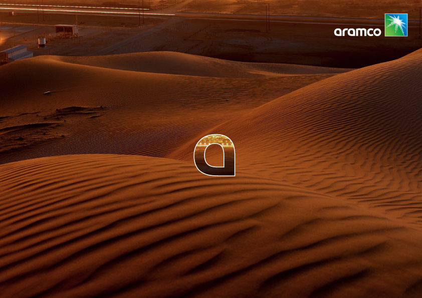
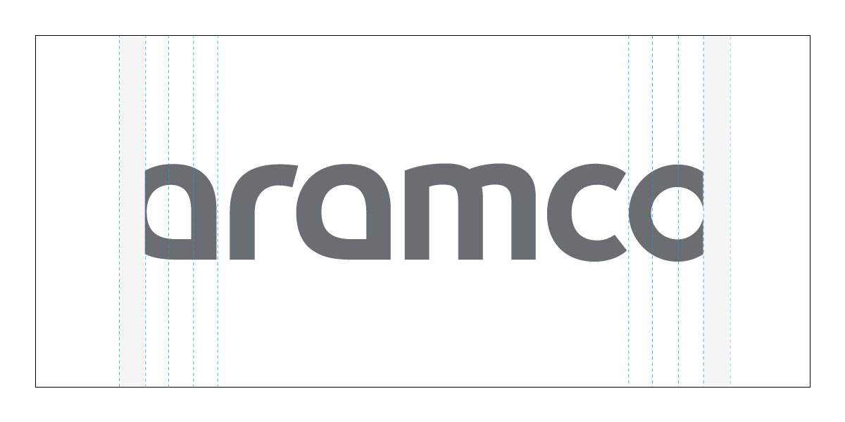
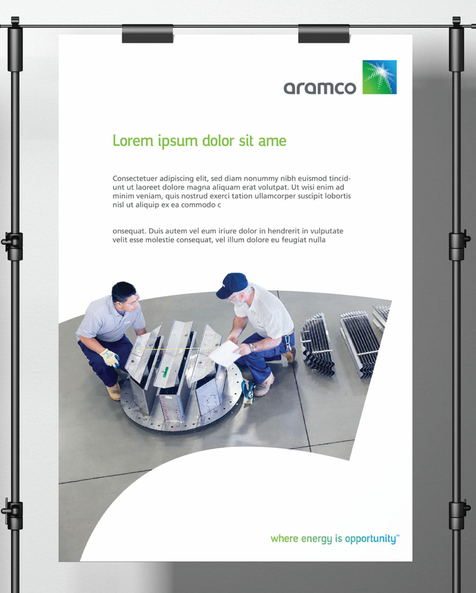
A partial crop of the wordmark is allowed to create impactful interaction between the brand and pictures. Be sure to send to Corporate Identity reviewers before submitting final work.

Option 1

(2 letters) Crop within the first third of letter (a) or the last third of letter (r)

Option 2

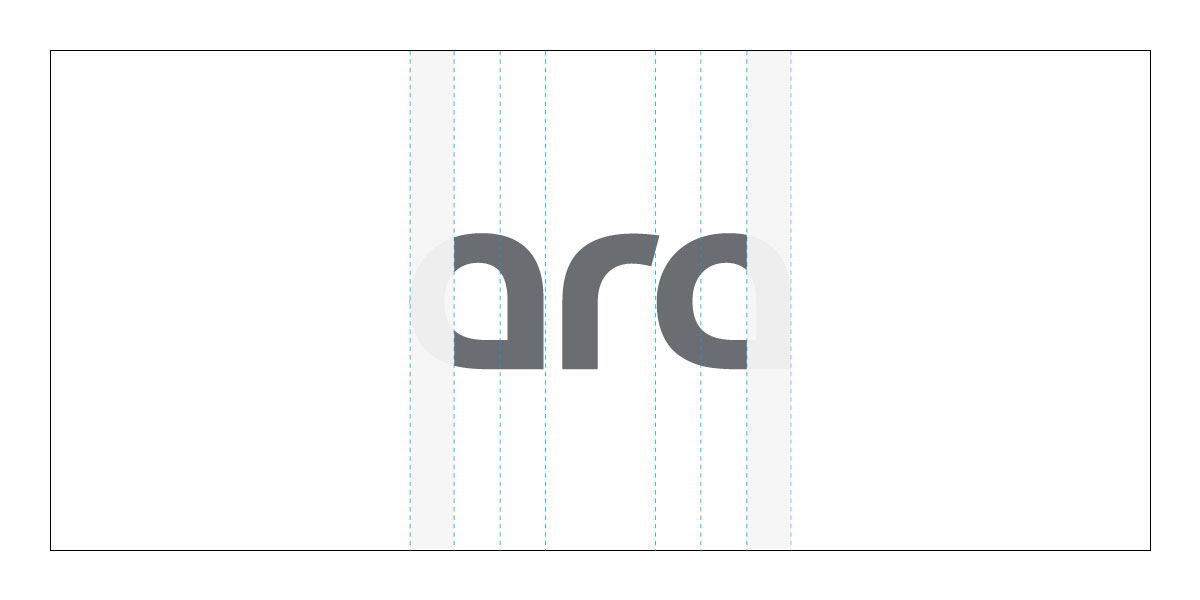
(3 letters) Crop within the first third of letter (a) or the last third of the second (a)

Option 3

(4 letters) Crop within the first third of letter (a) or the last third of letter (m)

Cropping from the bottom is allowed on all options by following the below rule: wordmark height divided by 6.. Crop is allowed on two sides only
Specifications - Letter stroke
Step 1

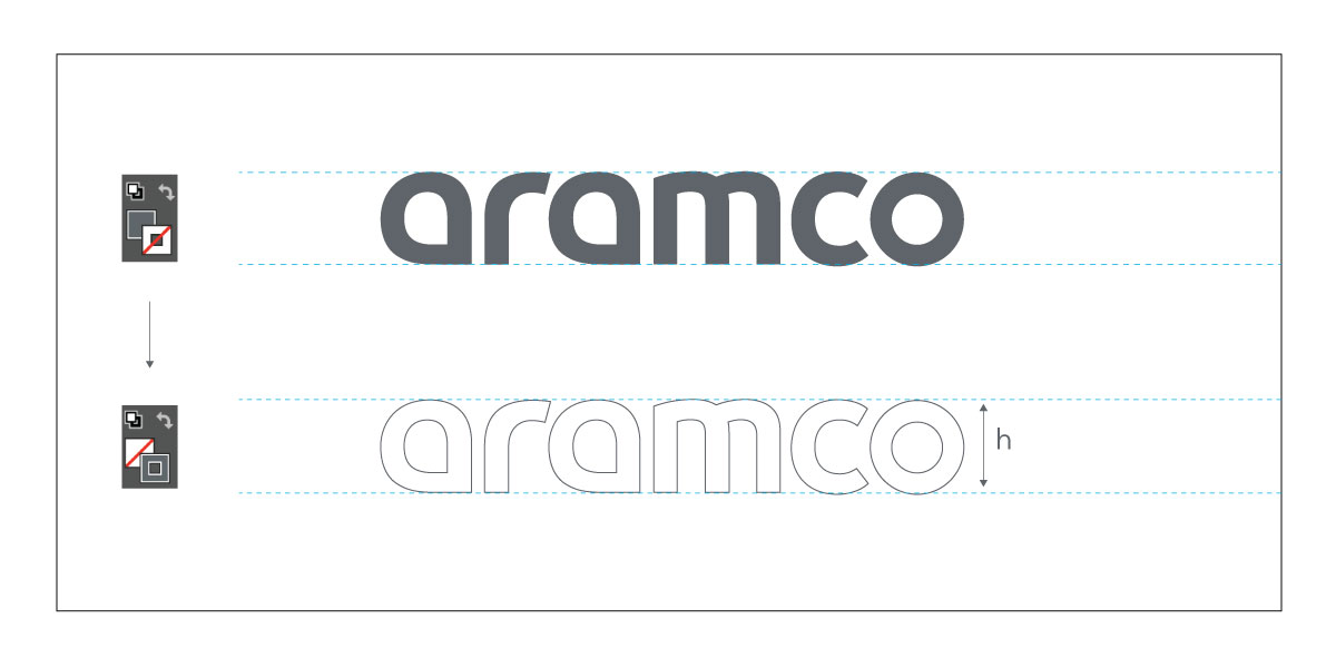
Change the color setting from fill to outline.

Step 2

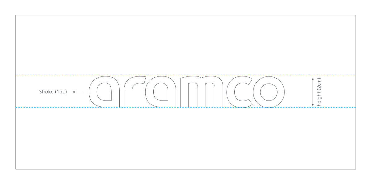
Create the stroke based on the following formula: 1. Letter height [h] in centimeter divided by two = stroke in pt.

Window wordmark

Windows are designed to highlight specific subjects like: people, technology, resources, nature, and our positive impact in the world, it can be used externally when the logo is visible for internal communication.

Window wordmark principles
On the window format, the letter “a” is allowed to be used externally if enough branding (logo) is present around it. With applications where a picture is on top of another picture, an outline should be present to highlight the shape of the letter.
On the window format (not close-up), you can use the remaining letters alone when in sequence.
Principles - Close up window wordmark
Close up windows should be used to highlight specific subjects.
The double stroke from the window close up can be used separately to highlight copy or important content.
The window should always be filled with one picture.
A borderless version of the window close-up can be applied where a clear design is needed.
Two shades from the same color of the primary/secondary color palette must be applied on window double stroke. You can zoom in as much as 800% from any of our wordmark to create extreme windows.
Double stroke should be applied only on the window close-up category.
In extreme close-up formats (with and without strokes) the cropping should be from 20% to 30% of each letter.
Window wordmark rules

The window crop of the wordmark is also allowed to create impactful interaction between brand and pictures. Be sure to send to Corporate Identity reviewers before submitting final work.

Crop can be applied from any side by following the below rule: Wordmark height/8
Crop rule can be applied on any letter if they are used as full wordmark, in sequence with the letter (a).. Crop is allowed on one, two, or three sides only
Specifications - Letter stroke
Step 1

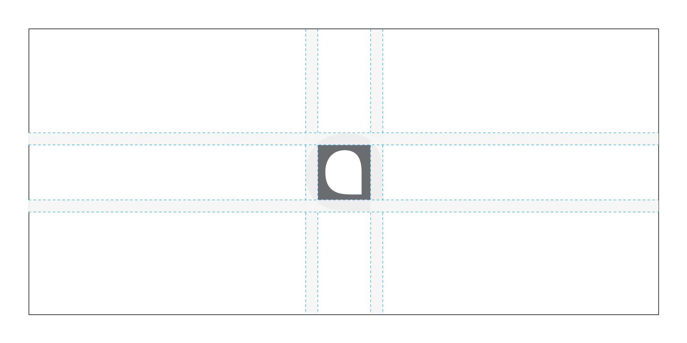
Change the color setting from fill to outline, and then create the stroke based on the following formula: 

1. First, open the wordmark file.
2. Choose one of the Aramco letters.
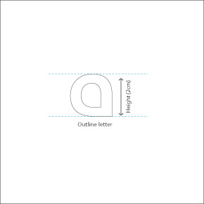
3. Set the letter height to 2 centimeters (cm).
4. Outline the letter.
 

Step 2

Create the stroke based on the following format:


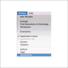
1. First, click on the letter, and then click on window from the menu bar, then click on appearance.
2. Select two shades from the same color of primary or secondary color palette, then set the first stroke color with the darker shade.
 

Step 3

1. Multiply letter height by two to identify the stroke value, if the height is 2 cm, the first stroke should be 4pt.
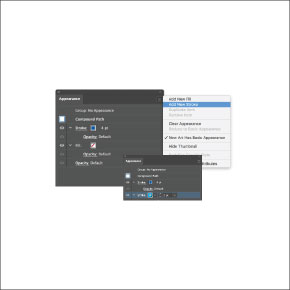
2. Click on "add new stroke" to create the second one and change the color to the lighter shade.
3. The value of the second stroke is equal to the letter height, if the height is 2cm, the second stroke should be 2pt.
 

Step 4

1. Click on the second stroke panel and align it to the outside.
2. Select the strokes then click on object from the menu bar and expand the lines.
 

Step 5

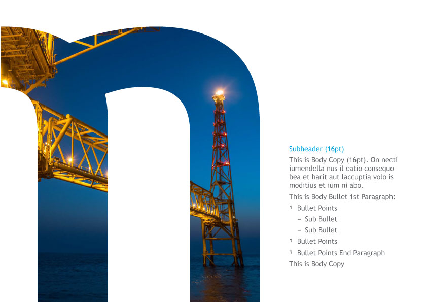
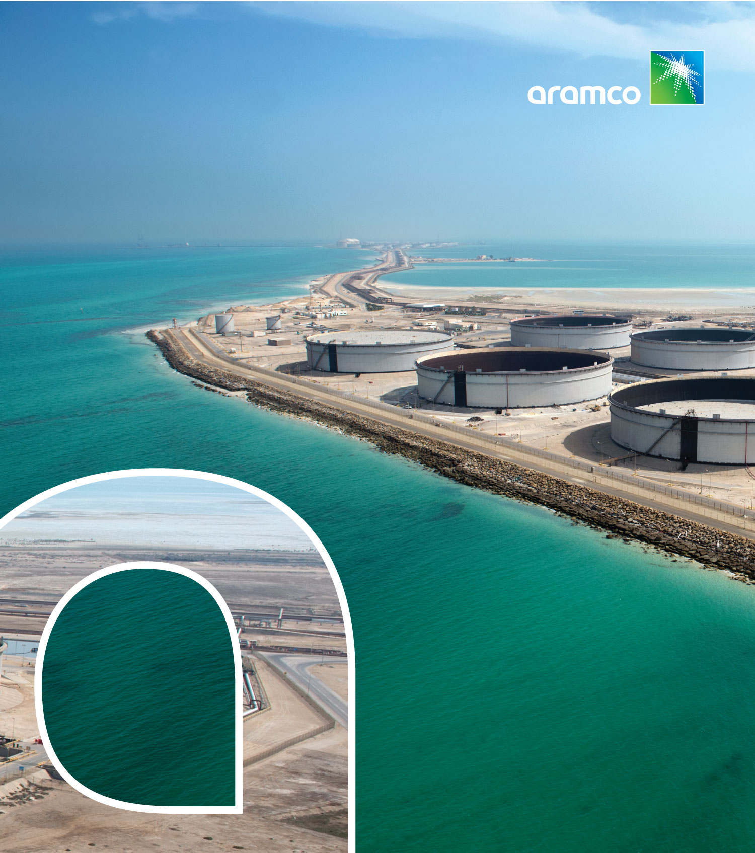
The double stroke should originate from any letter from our wordmark. 

Step 6

20% to 30% of the wordmark can be used. The letter that is used above is "m".

You can zoom in as much as 1200% from any side of our wordmark to create strokes.
 

Watch Video
Learn how to create a double stroke by using an Aramco letter.

Incorrect use

Don’t use the full wordmark with other colors except with White, or Dark gray.
Don’t use the full wordmark as an outline in photography.
Don’t crop the wordmark from three sides.
Don’t use our wordmark in small sizes.
Don’t use the wordmark if not interacting with the image.
Don’t distort the wordmark.
Don’t use a single letter alone except for the (a).
Don’t use the wordmark with an unapproved font.