Introduction
We use bespoke, simple, ownable icons that are distinct from our more elaborate illustrations. Our icons help us quickly communicate functions and features in digital, print, and physical space. They are visible at small sizes, and work in single color only, and their form is inspired by the geometry of the wordmark.
Aramco icons 3.10.3
All icons of the Aramco Icon Library in the following formats: SVG and PNG
Icon library
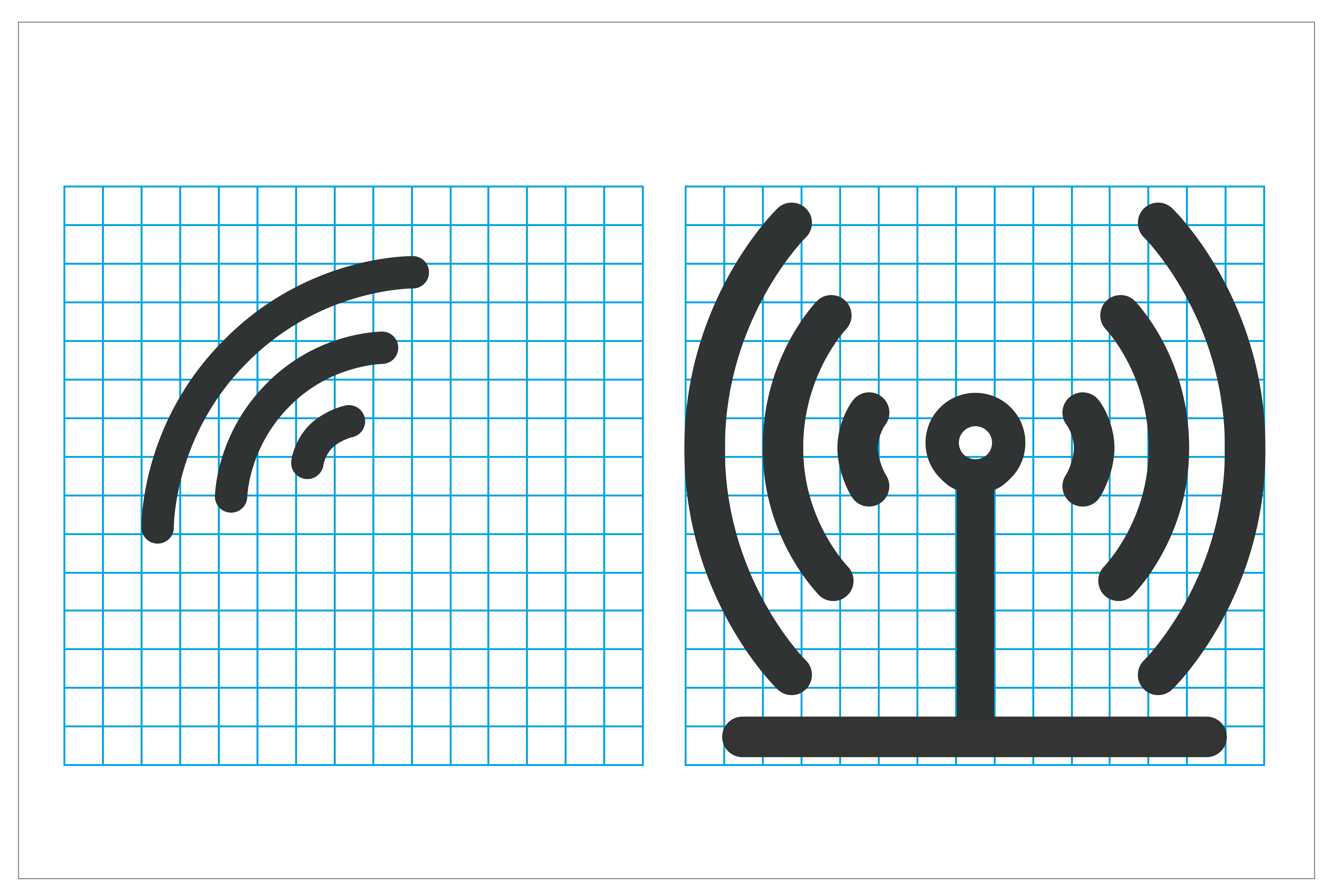
We have a library of ready-to-use web icons.
And error occurred! Please, try again.
App icons
Our family of app icons should feel like a cohesive set of graphics that make visual connections to our brand. Icons for apps that are used externally use the primary colors. Icons that are for internal audiences use either primary or secondary colors.
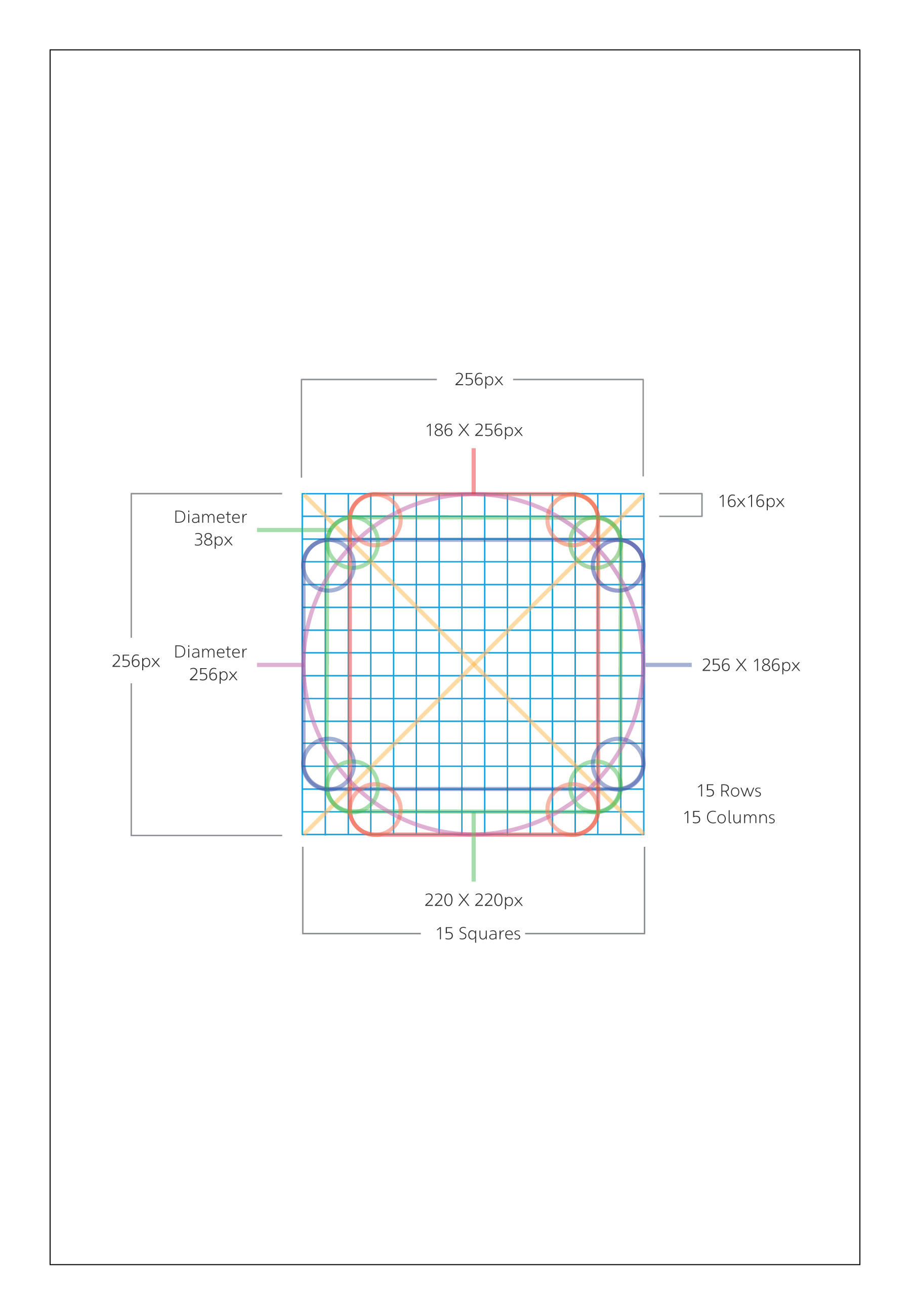
The size of an icon within an app icon box is determined by two extra units around the icon.

Icons for apps that are used externally use the primary colors.

Icons that are for internal audiences can use either primary or secondary colors.
get_appDownload Icon Grid
Specifications
For icons that may require a unique solution not found in our library, follow the steps below to produce custom ones. Note that custom created icons must be reviewed and approved by Corporate Identity reviewers. Custom-created icons require advanced knowledge of Adobe Illustrator.
Step 1
Use the iconography grid available above.
Step 2
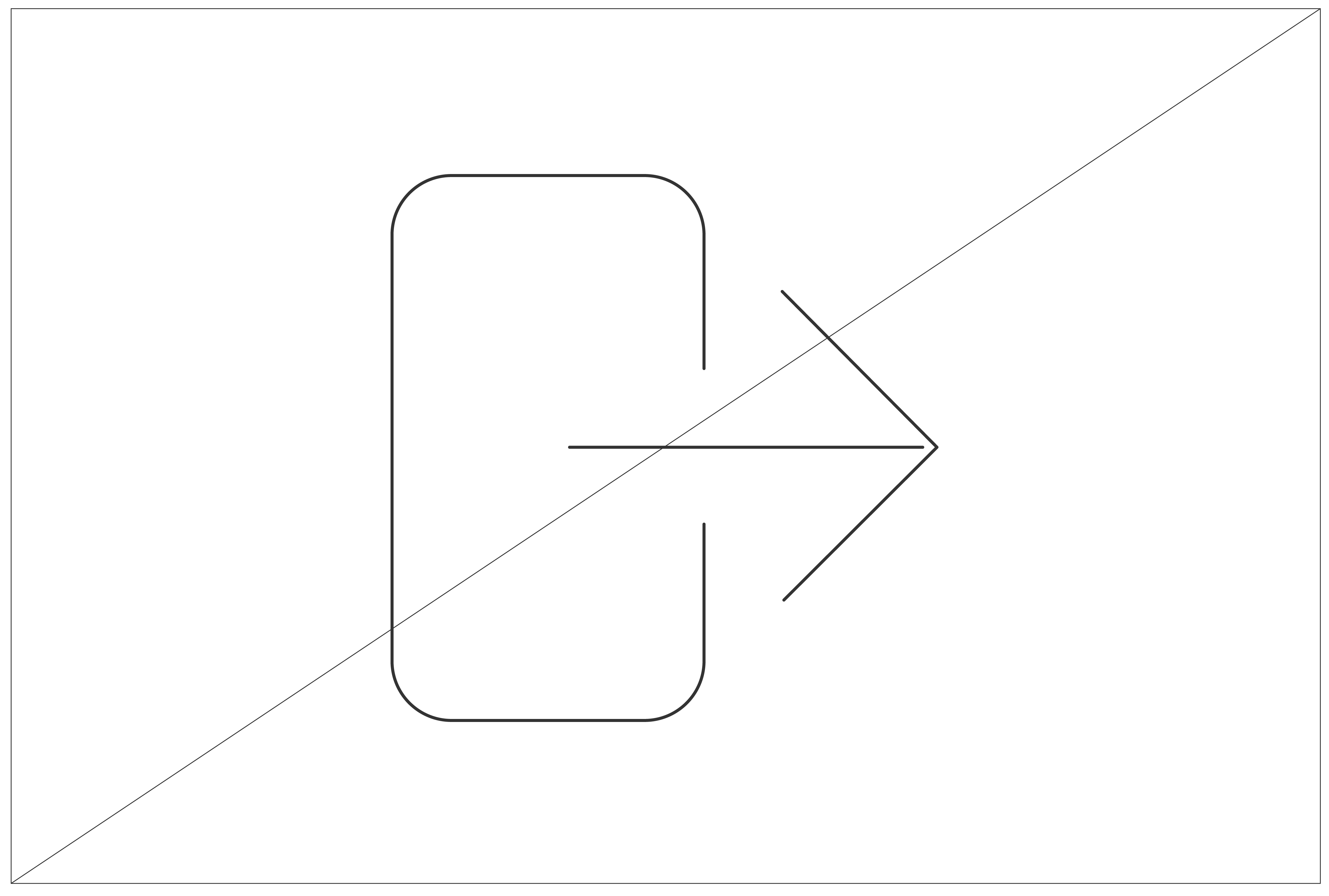
Use the pen tool to create the icon. The stroke weight is 18 pt. Ensure that the stroke cap and the corner are rounded.
Step 3
Draw the icon within the grid.
Step 4
Make sure to outline the icon before using it.
Protection
Iconography should always be used with enough space around it so that it is clearly legible and not obscured by other graphic elements.
Clear space
The minimum clear space around the icon is equal to the icon height [h] divided by five.
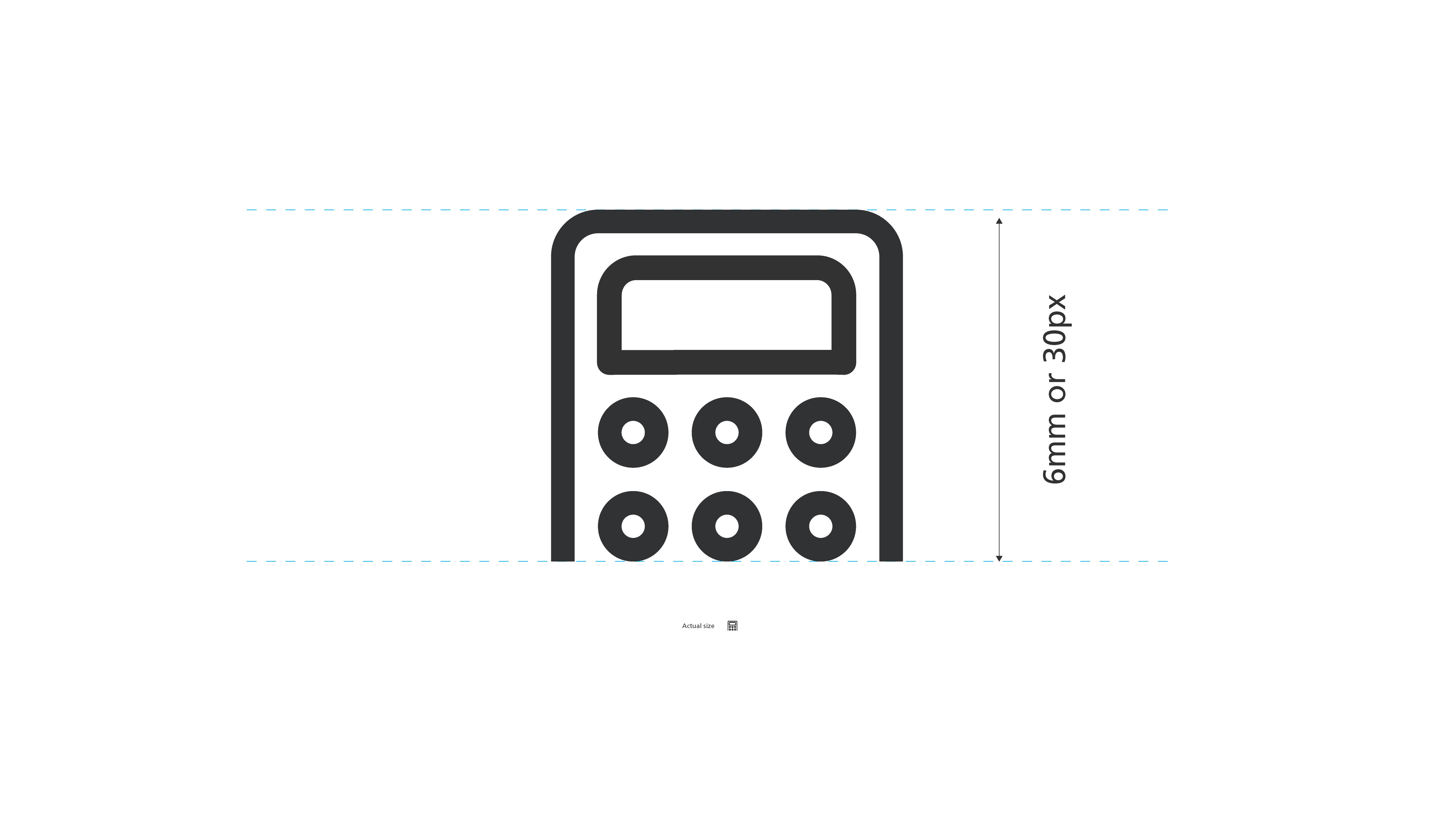
Minimum size
The absolute minimum size of iconography is 6 millimeters (mm) in print or 30 pixels (px) on screen. The minimum size is determined by the document viewed at 100% on screen printed at full size.
Principles
Following the principles for iconography use and creation and use below, which will allow our graphical shorthand to connect across our brand.

Icons are used as shorthand for function or navigation, or to replace a word or idea in a diagram.

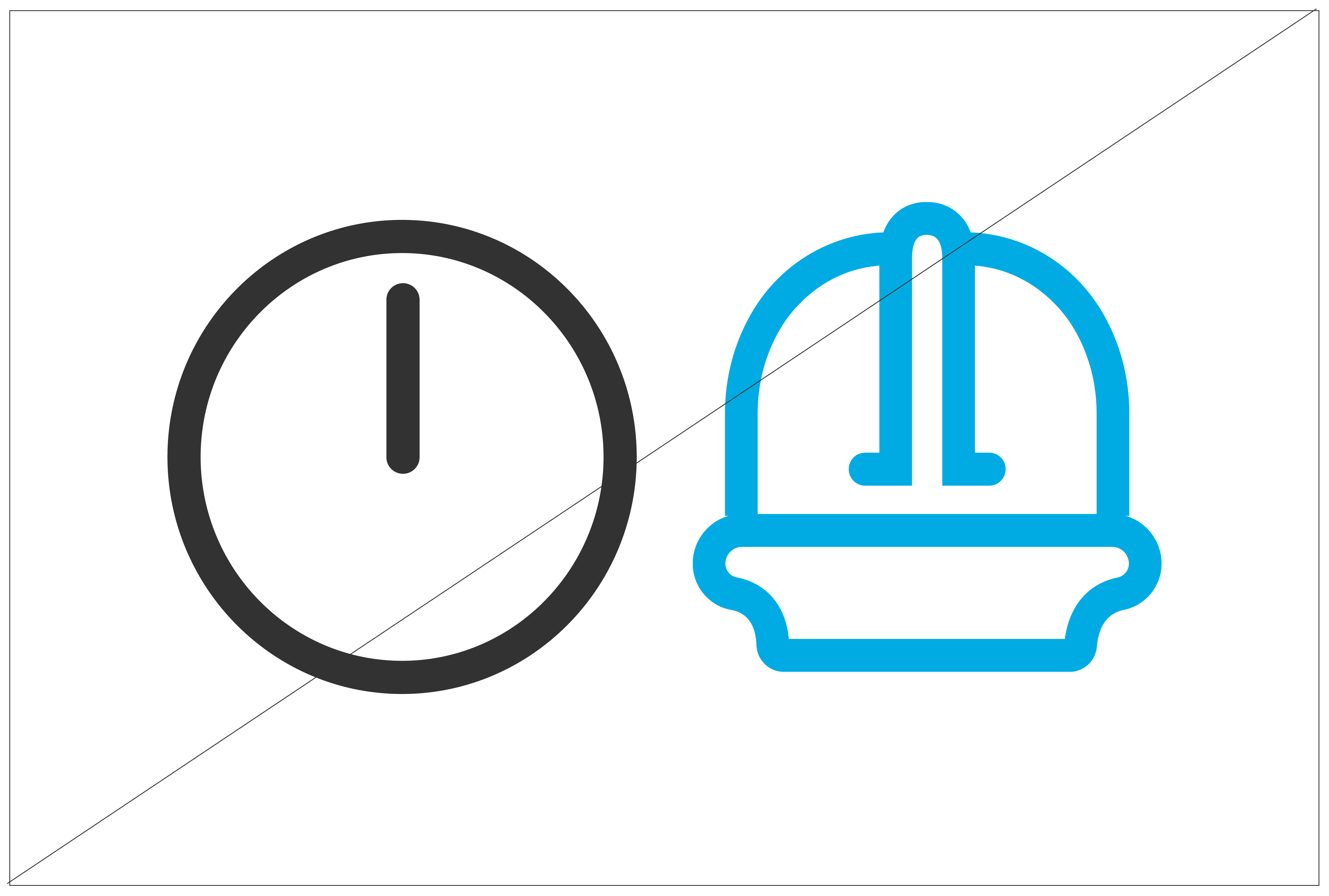
Use primary color for external use.

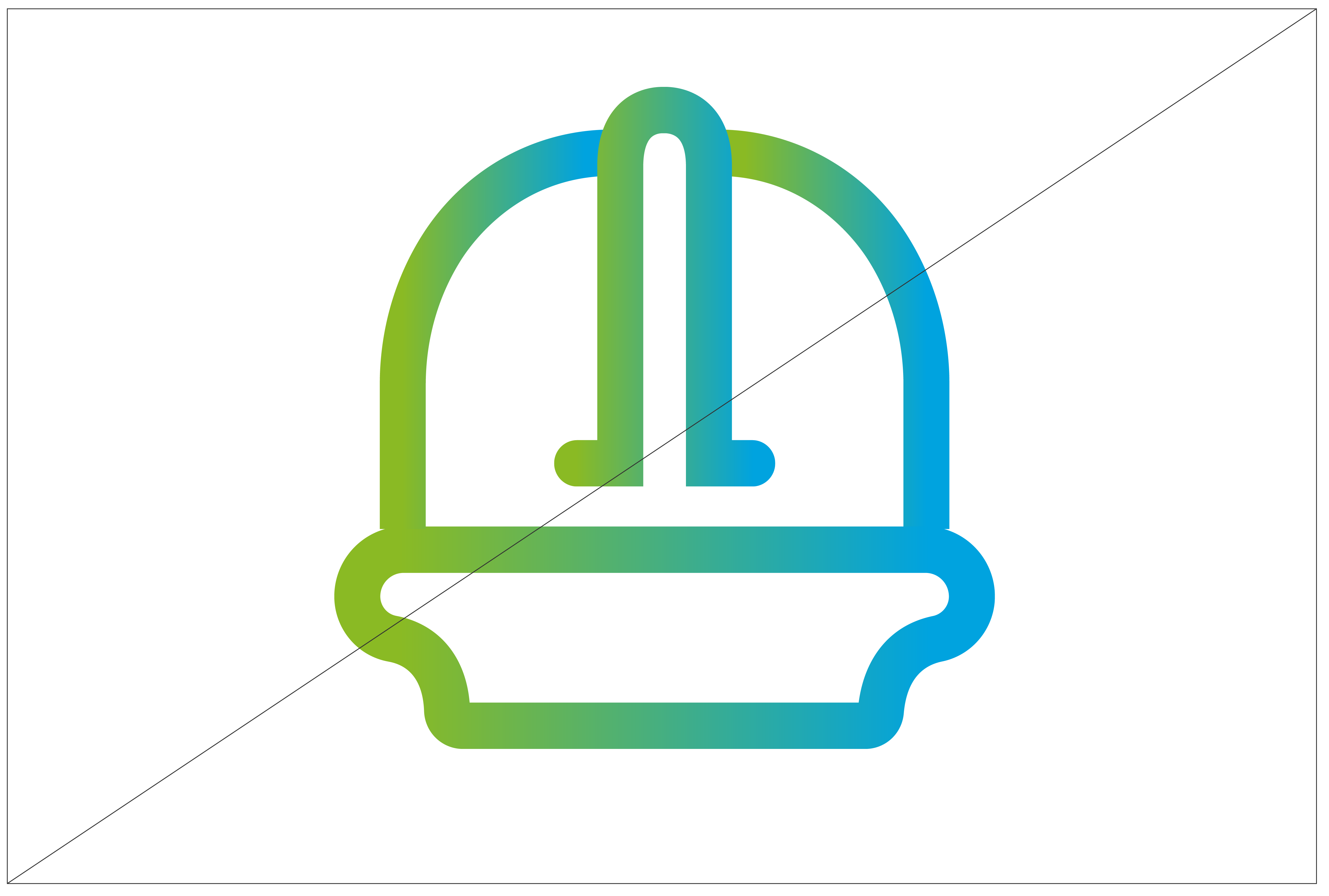
Icons can be used with primary and secondary colors on a White background.

When using colored background, use a White icon.

Use secondary or primary colors for internal use.
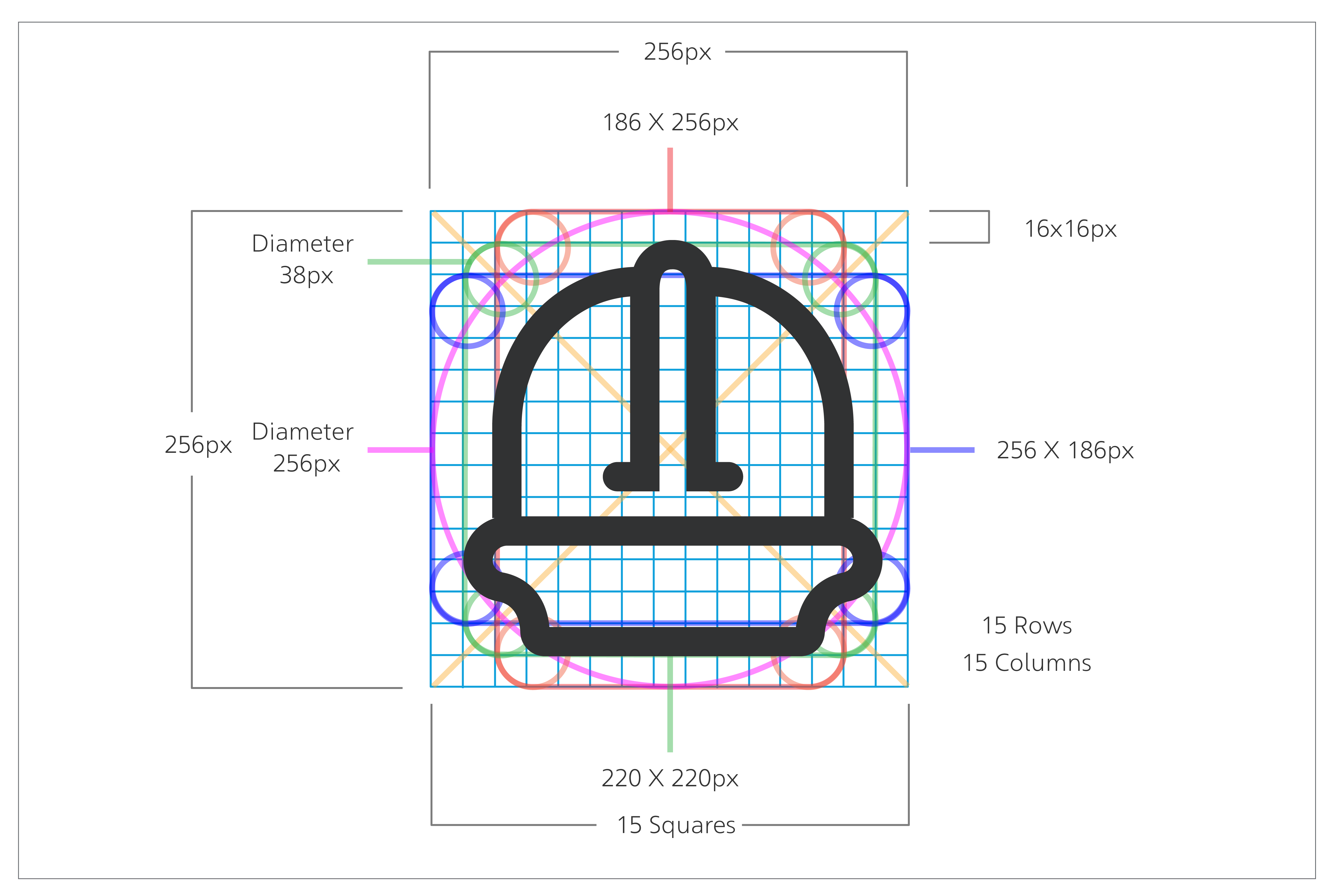
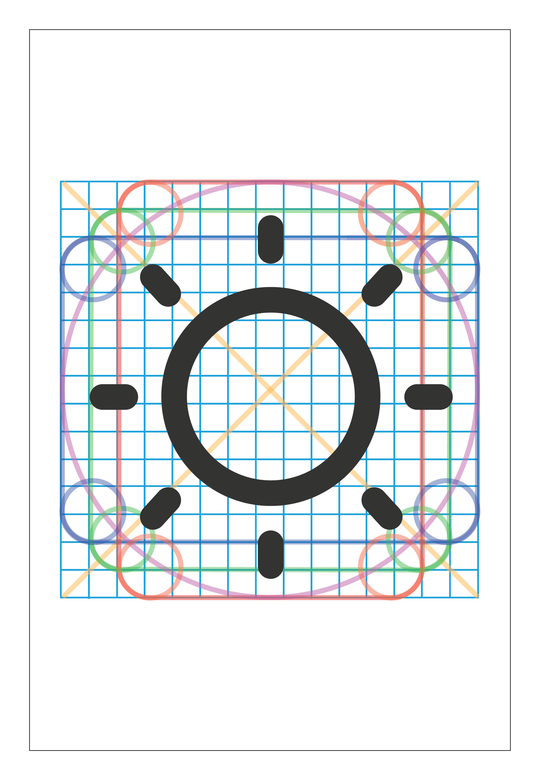
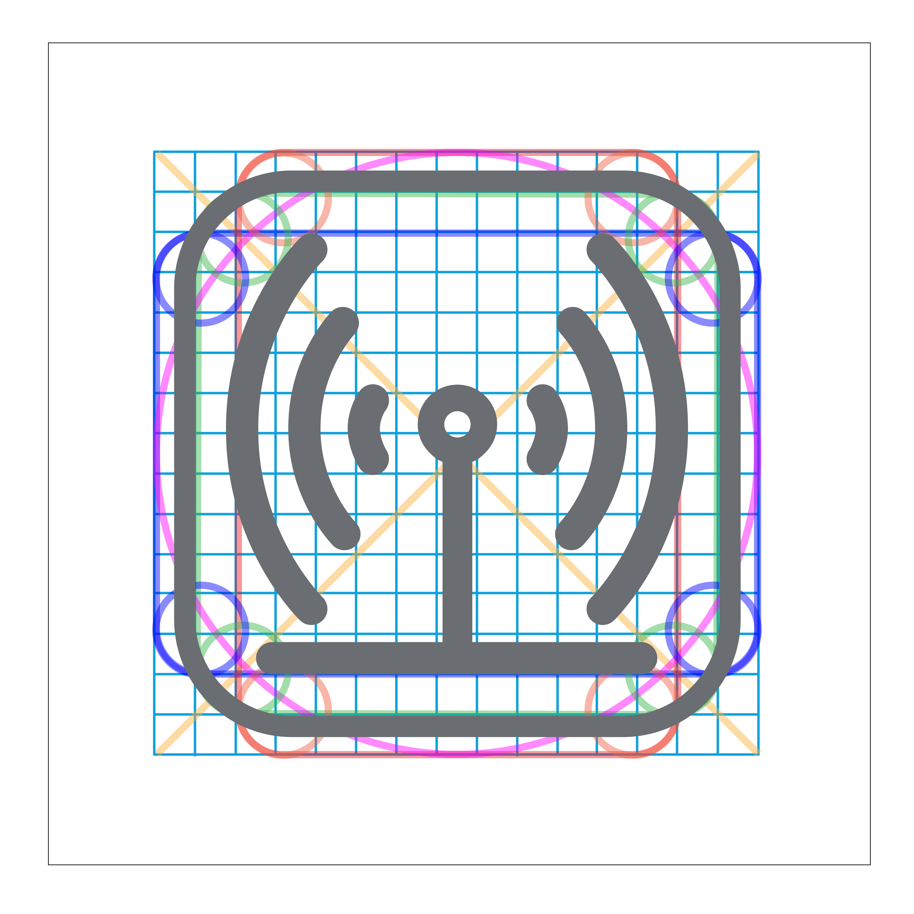
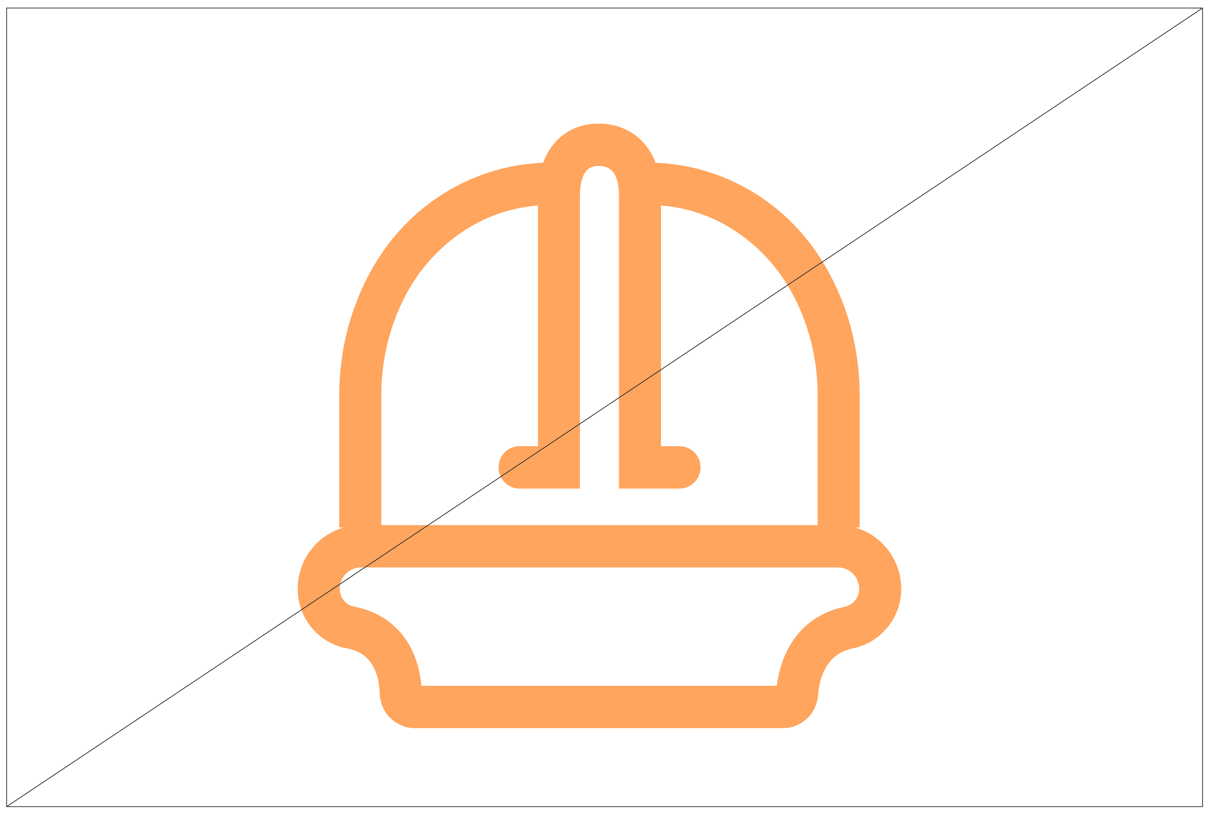
Icons are constructed on a 15 x 15 grid of equal squares with 3 layers tolerance demarcation.

Icons are created from geometric arcs and straight lines. Diagonal lines at 45 degrees can also be used when needed.
Some icons may require forms that won’t easily fit the grid, such as an arc at 45 degrees. In these cases, draw the relevant parts on the grid, and then rotate to finish the icon.
Things to avoid

Do not apply drop shadow.
Do not change the weight of the lines.
Do not use gradient.

Do not change the style of the icons.
Do not use non-approved colors.

Do not change the clear space.
Multiple icons per page should all be the same color.

Do not use ready-made icons from different sources.