Secondary palette
The secondary palette is used mainly for internal communication when not communicating Aramco’s core businesses, official management announcements, or HR communication (in these cases, the primary colors should be used). To create more tones, they can be used — if needed — at 70% and 40% tints. These are the only tints that should be used.
Color principles
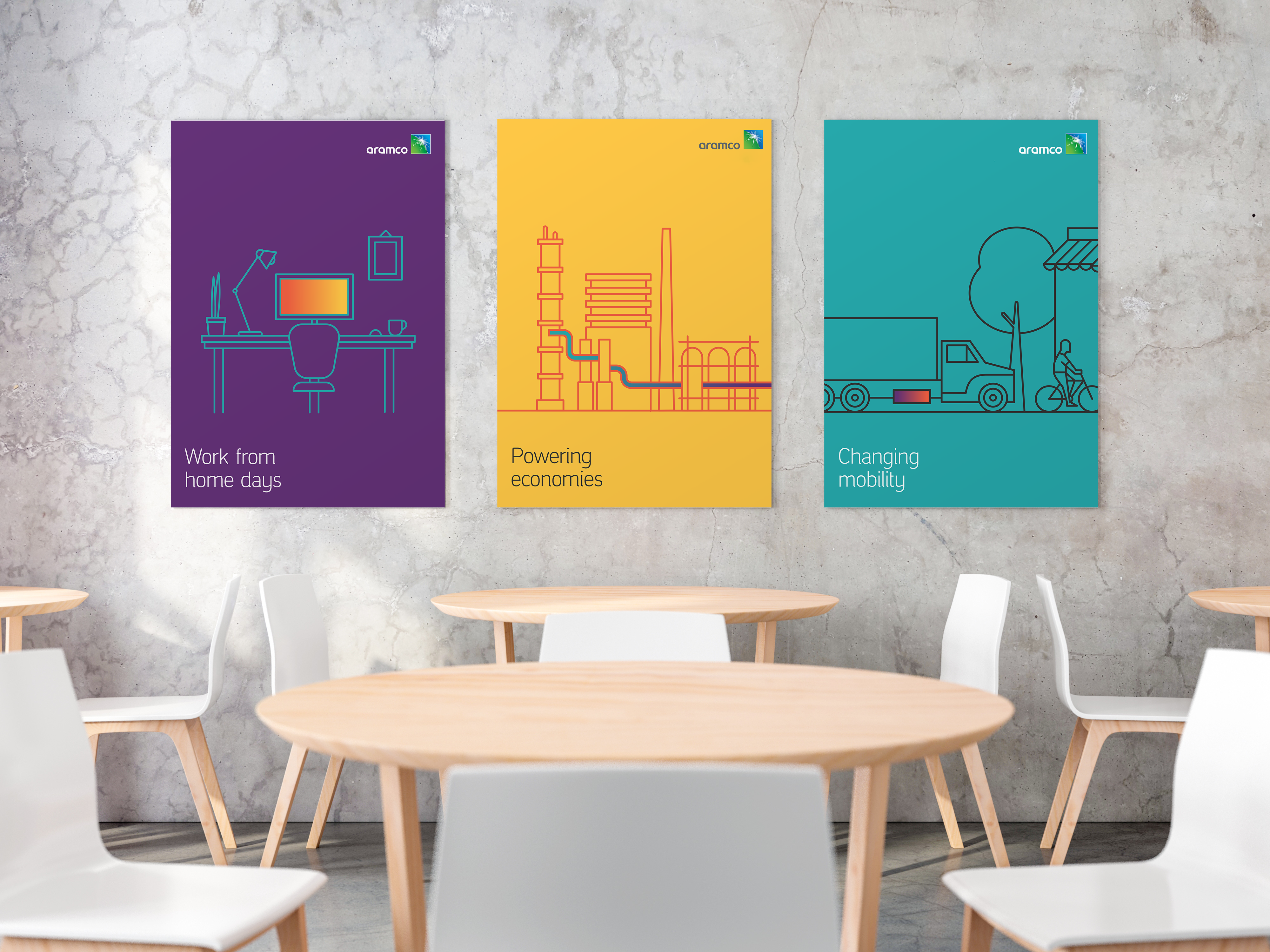
The primary color palette should be used for external use, supported by the secondary palette when needed to highlight important subjects (max use of 10% of total layout).
The Secondary colors may be used, when needed, for more complex design or to complement to the primary colors in external communication.

Headlines should be in Green, Blue, or Dark Gray on white or neutral light backgrounds.

Type should be in White when on a dark colored background.
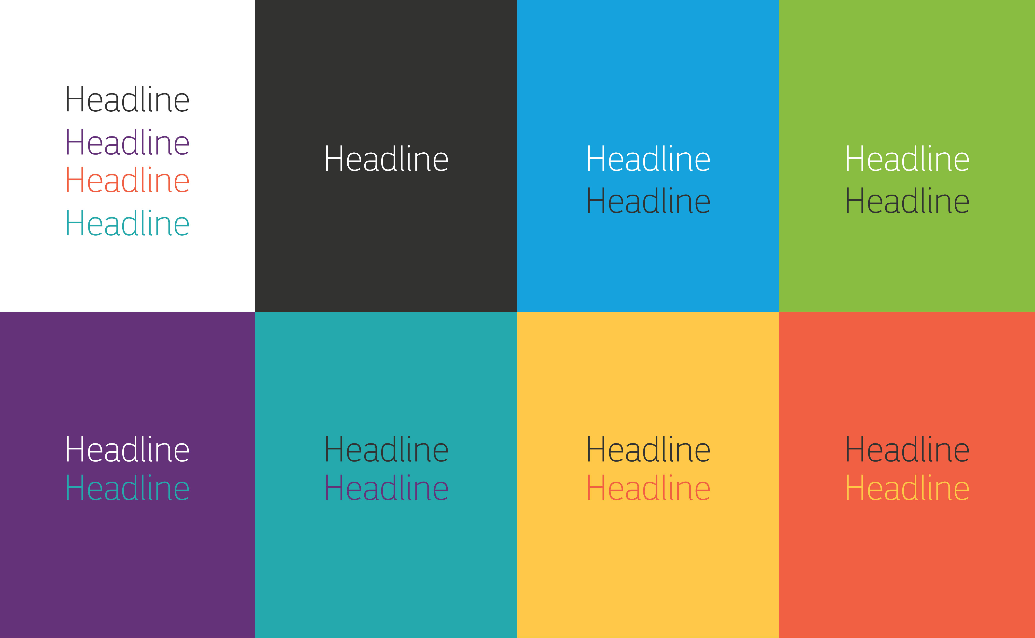
Internally you can use secondary colors as headers
The secondary color palette should be used for internal use, supported by primary palette.

Spot colors or CMYK color values should be used for anything that is printed.

70% and 40% are the only tints that are created from the secondary color palette.
Hex or RGB color values are used for digital or screen use.
Things to avoid - Color

Don’t alter the color values.

Don’t use tints other than 70% and 40%, exception for grays.

Don’t add additional colors to the palette.

Don’t use the wrong gradient sequence.

Don’t use an excess of secondary colors with the primary palette.

Don’t use tints before secondary colors.
Don’t use secondary colors for formal use.

Don’t put two colors together that clash.
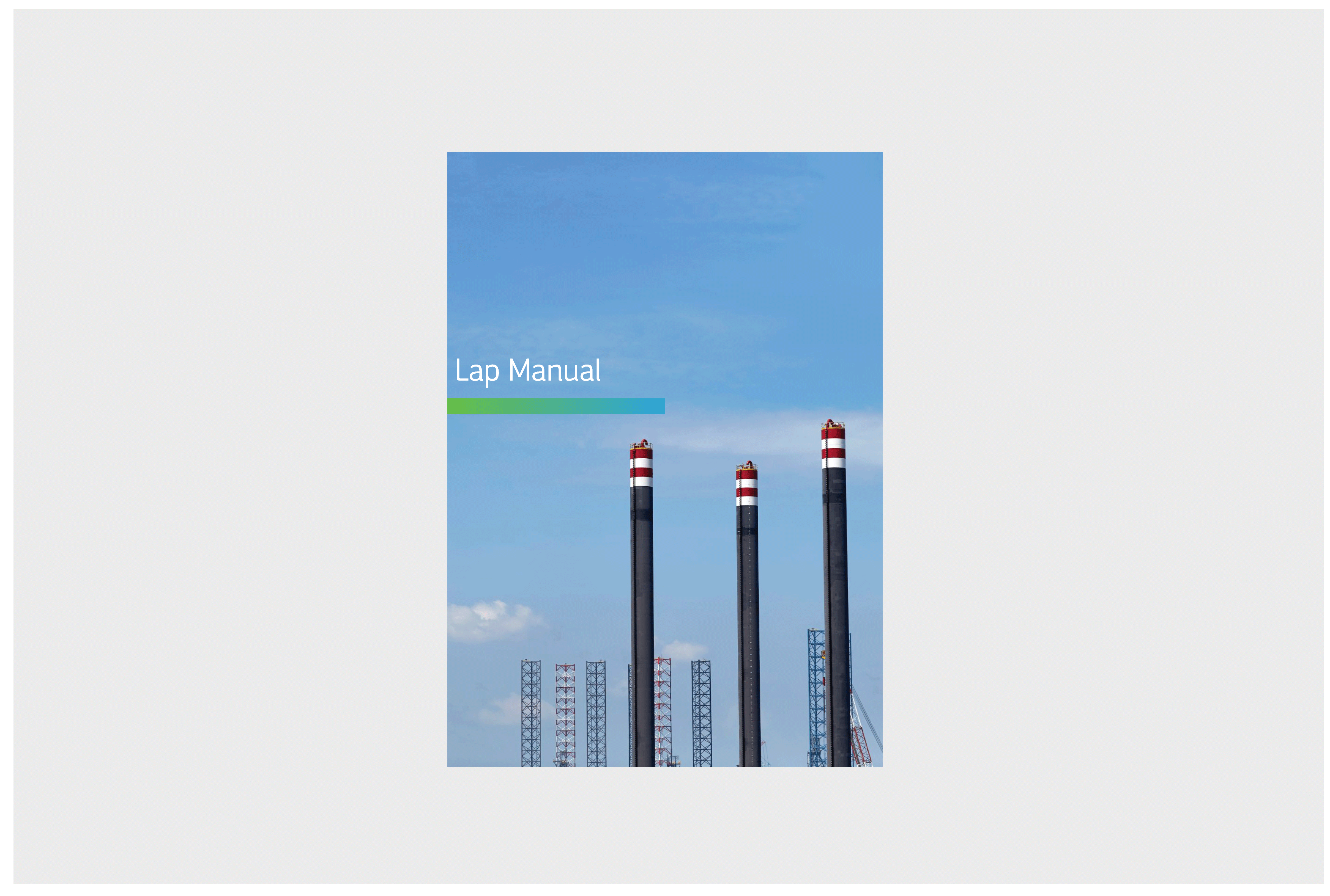
Gradient
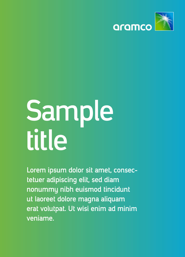
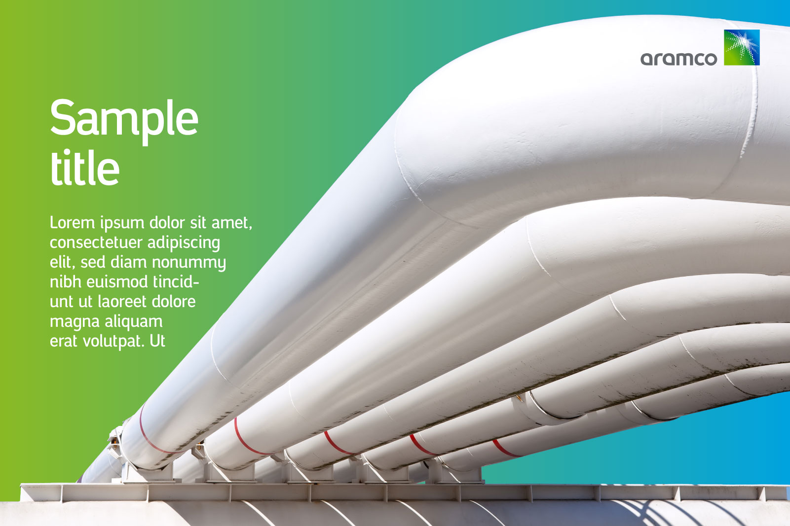
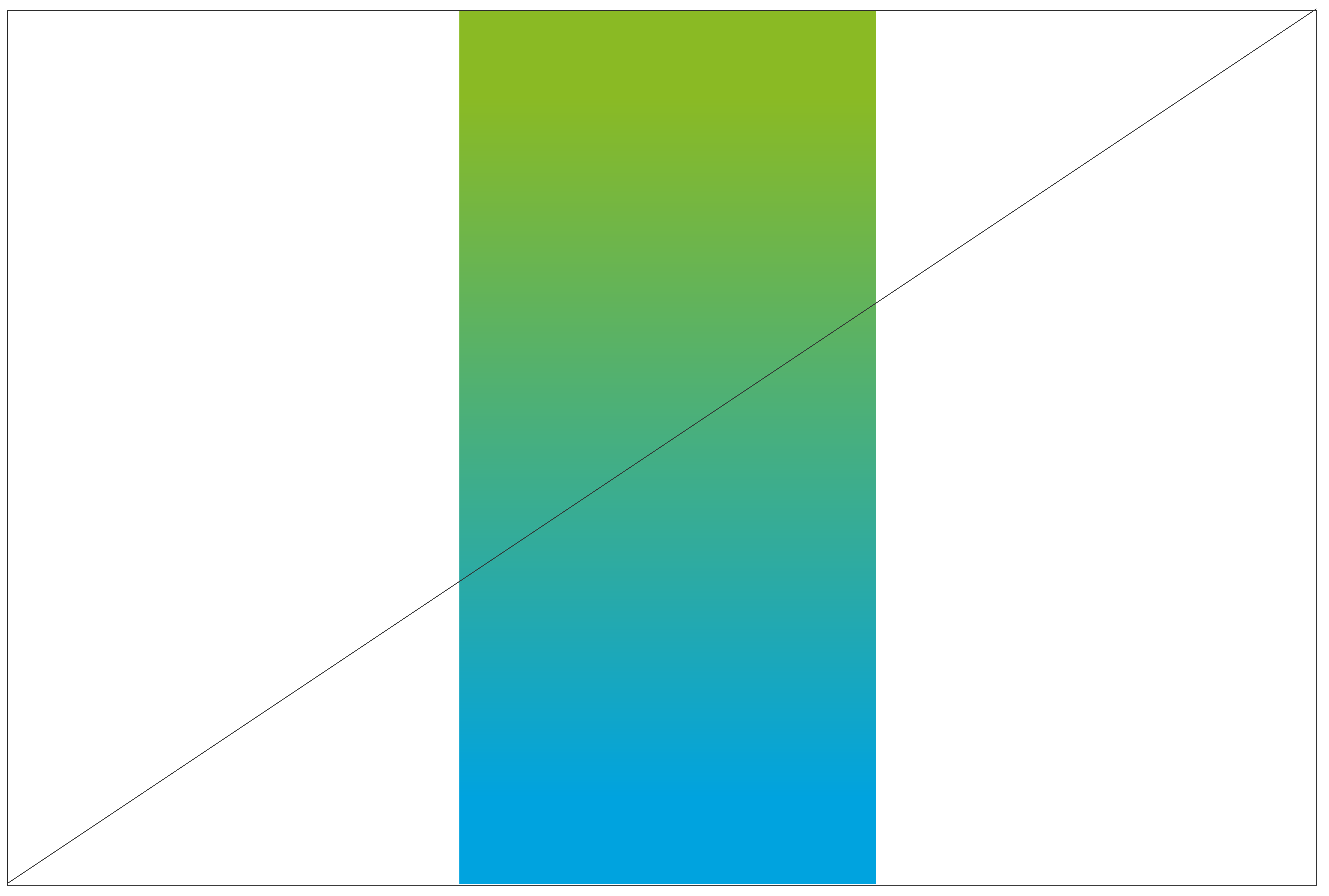
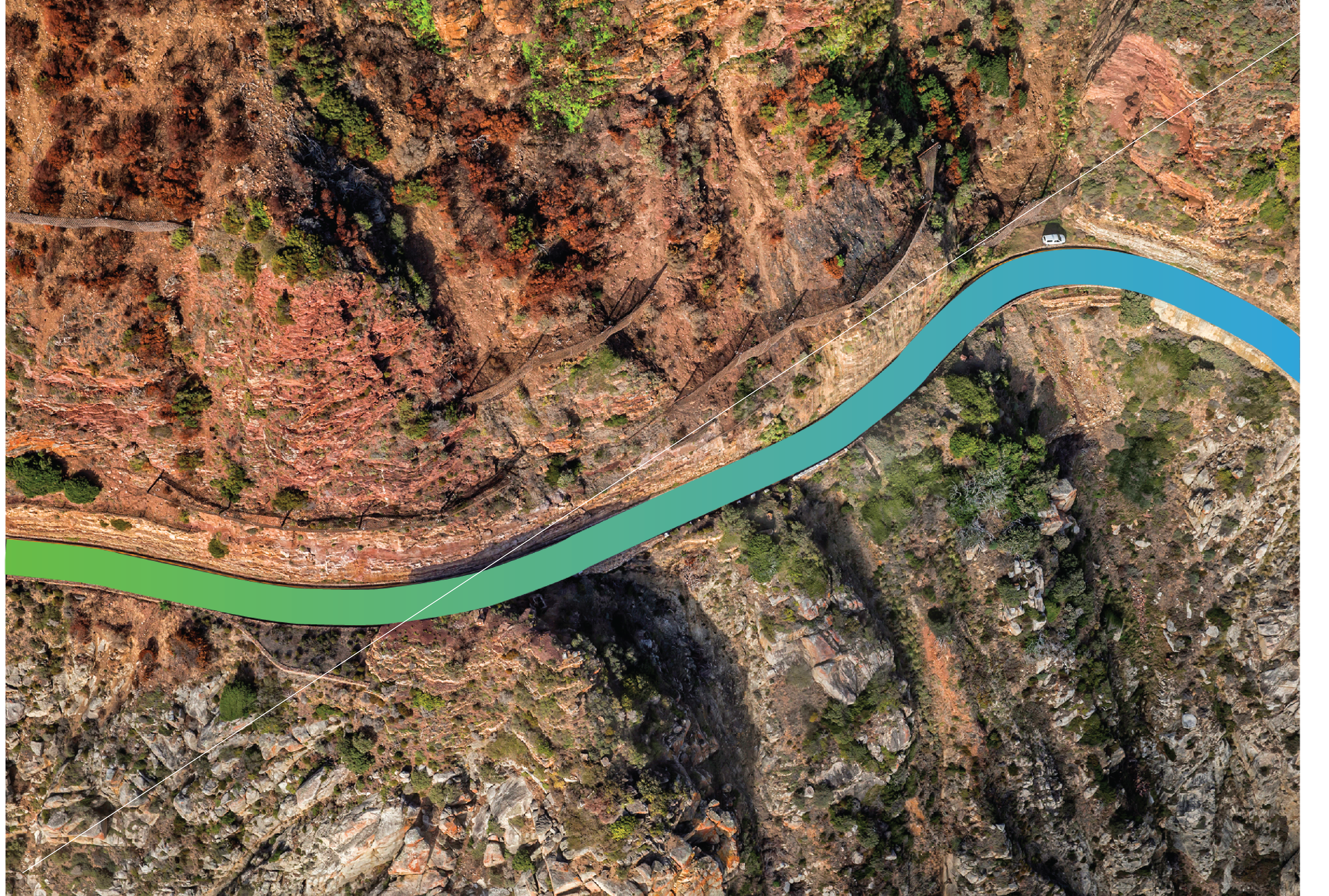
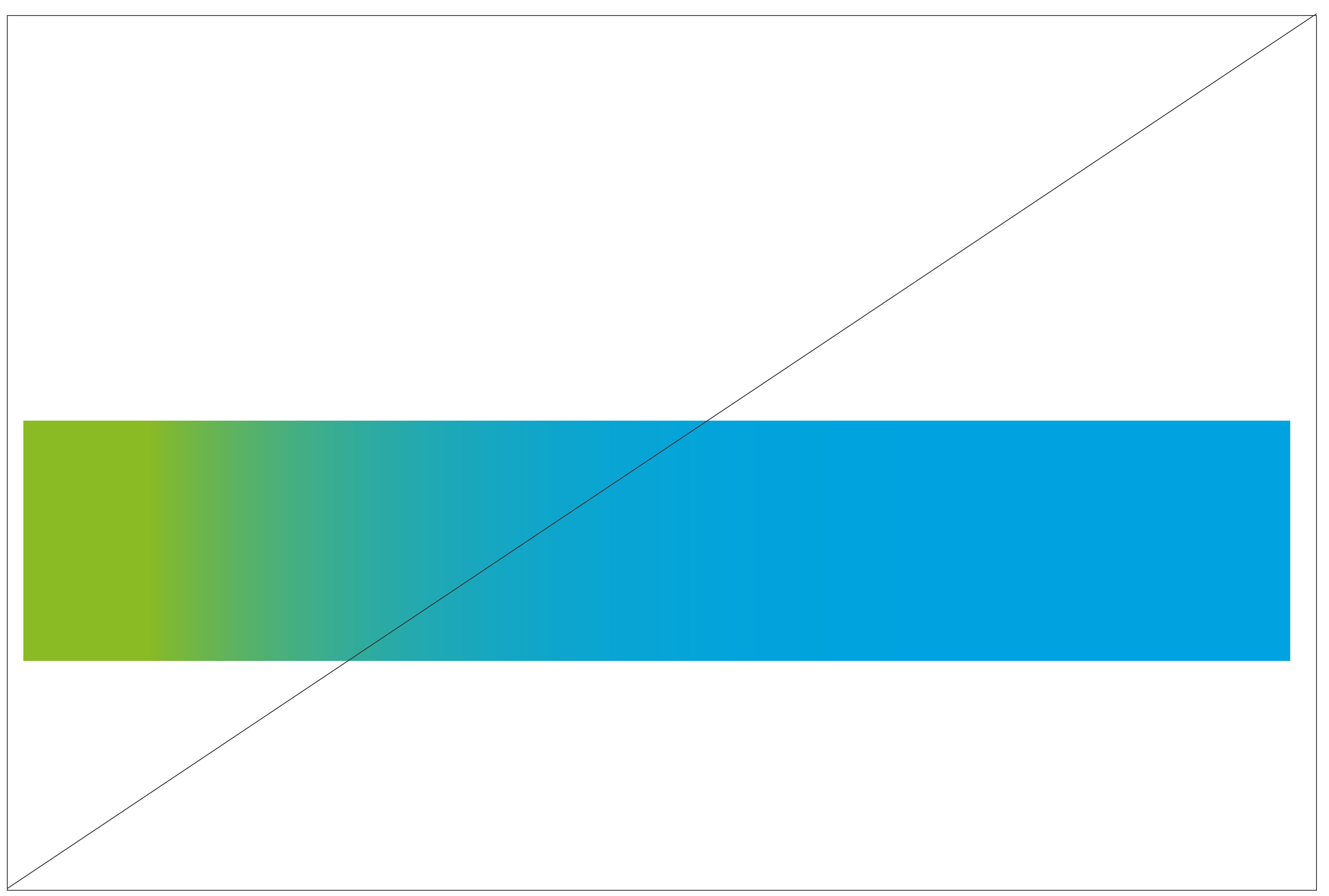
The Aramco core gradient is a combination of our two primary colors Aramco Blue (representing the sky) and Aramco Green (representing the earth). combination creates our vibrant gradient that conveys energy. It is used internally and externally. The gradient is a blend of Aramco Green and Aramco Blue. The gradient is constructed using the same positions: color 1 at 0 to 10%; the blend at 10 to 90%; color 2 at 90 to 100%. This ensures that the original colors at either end have enough presence. The sequence should always be from green to blue (left to right / bottom to top)
get_appDownload Gradient as PDF
get_appWatch how to create gradient box/backgroud
Gradient Examples
Gradient principles
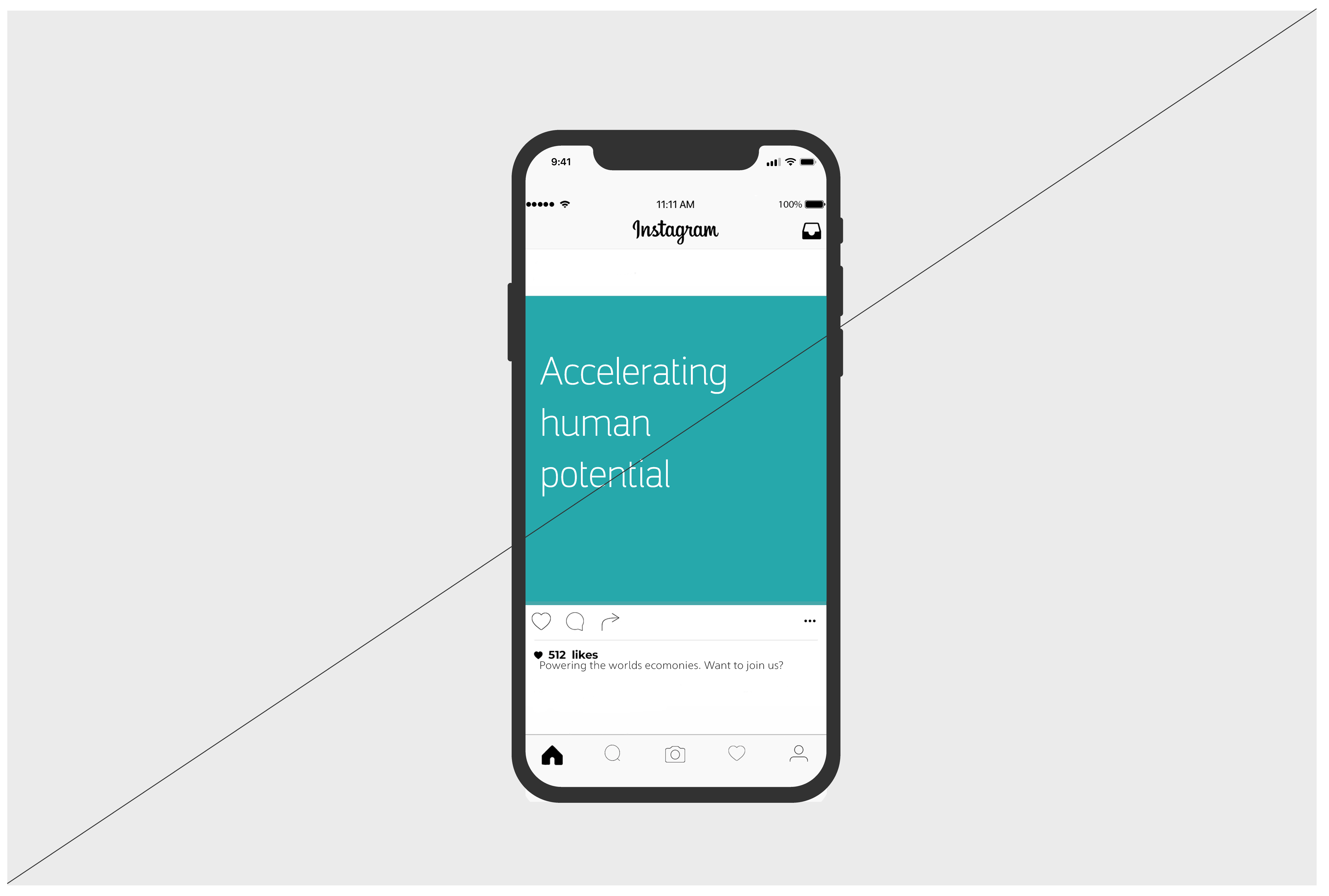
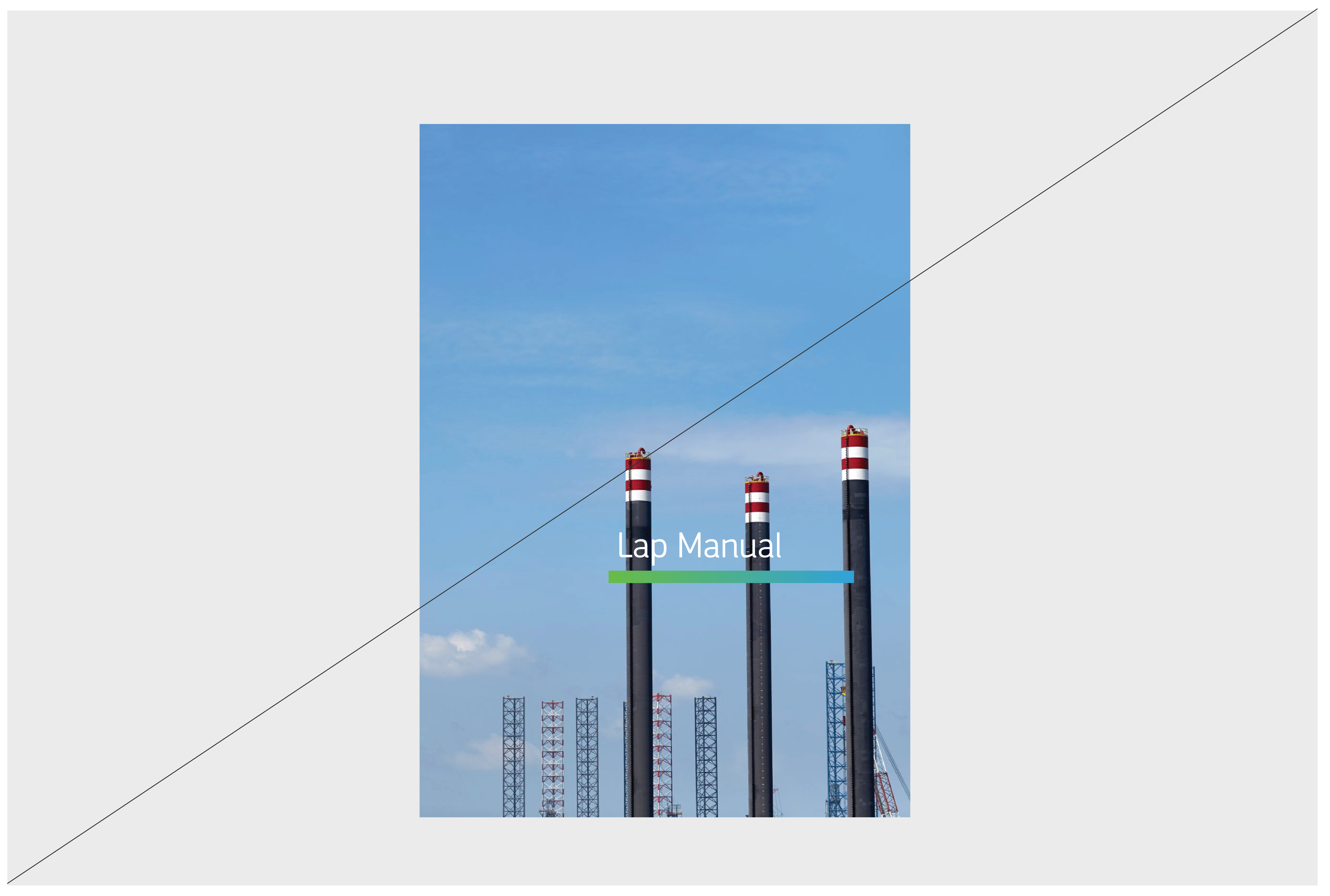
The gradient can be used to highlight texts/ important information.

The gradient must start with Green (from left to right).

Full gradient background is allowed to highlight important content

Use Aramco Green and Aramco Blue to to create a gradient.

When the gradient is used vertically, Blue must be at the top.

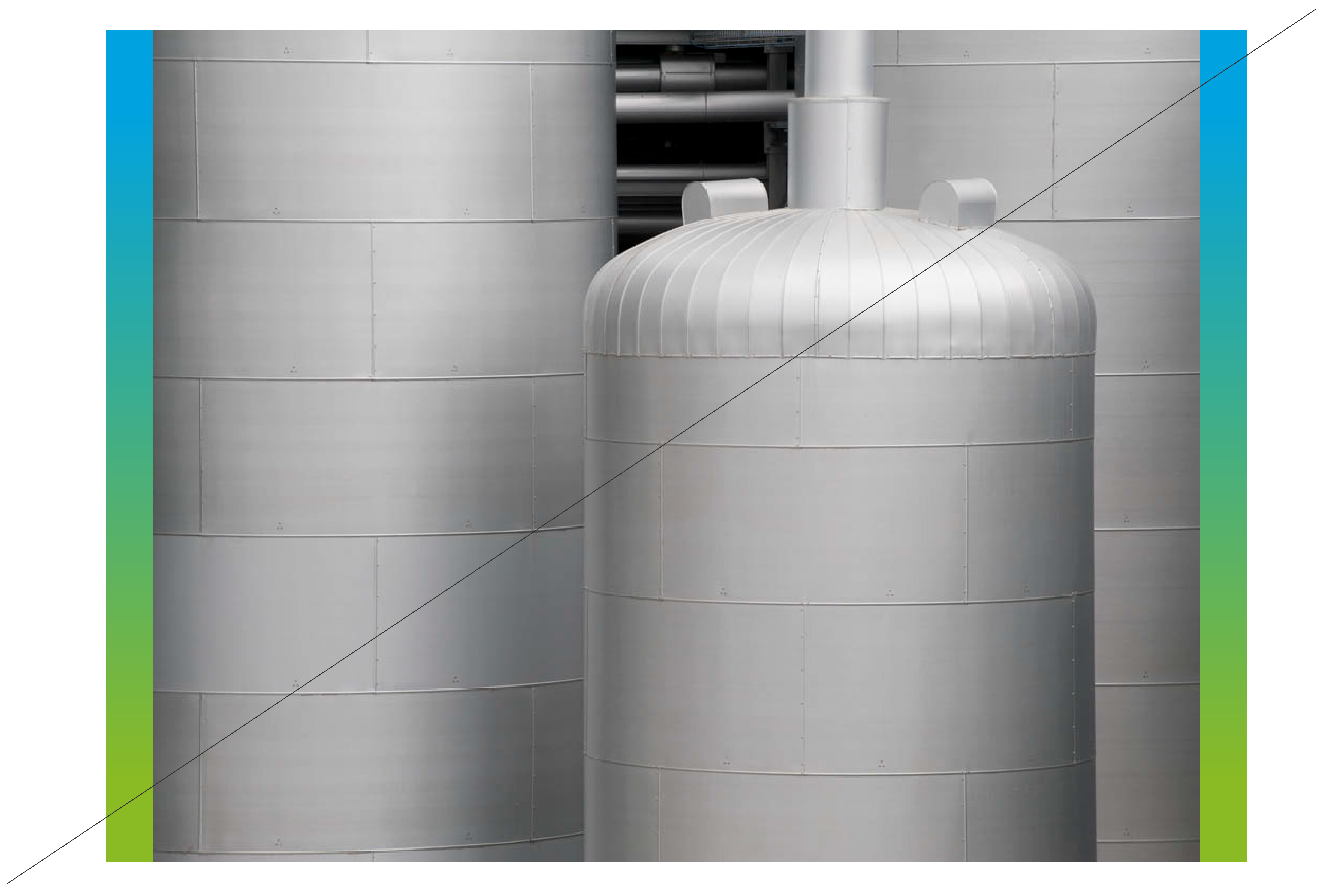
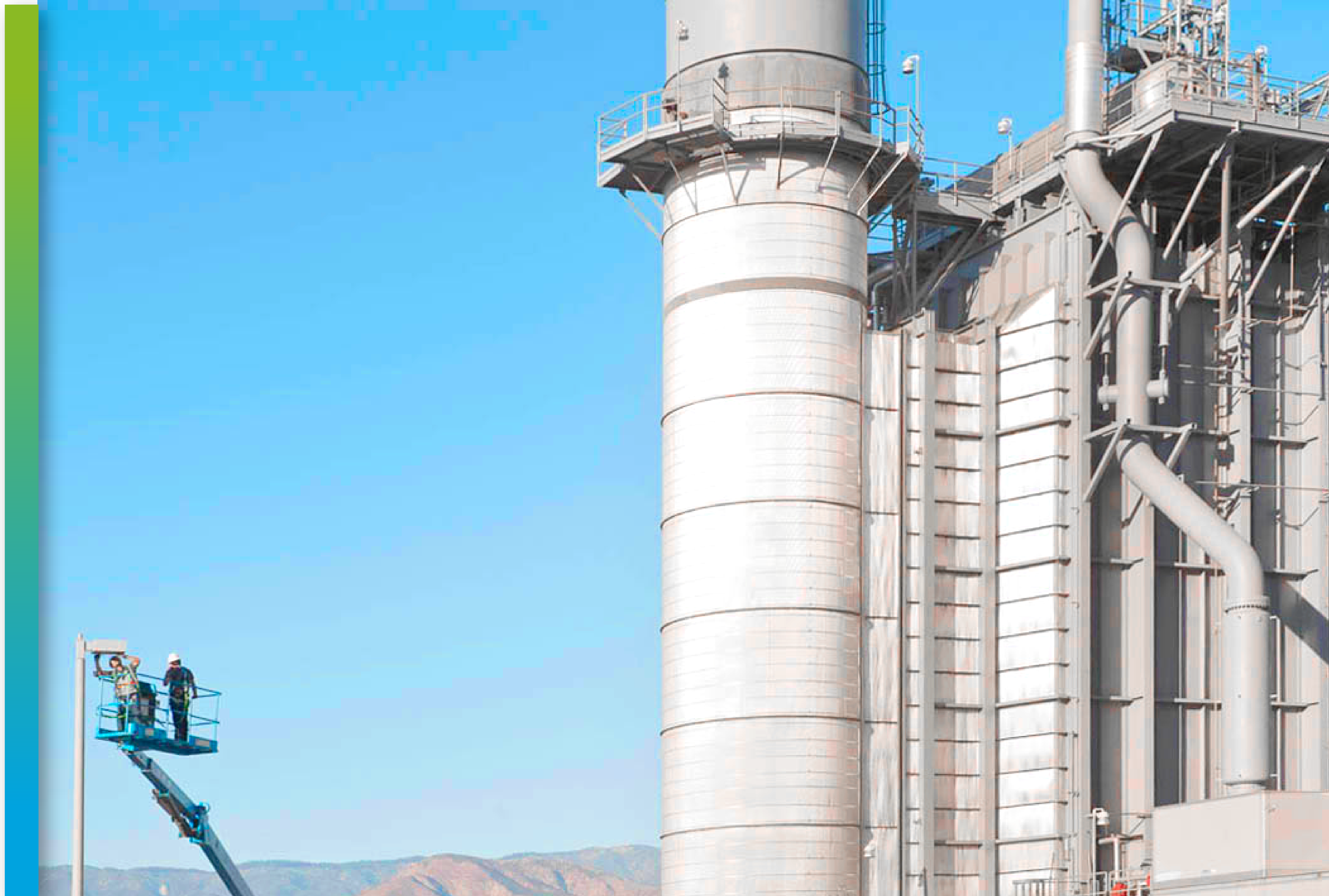
The gradient can highlight a part of an illustration.
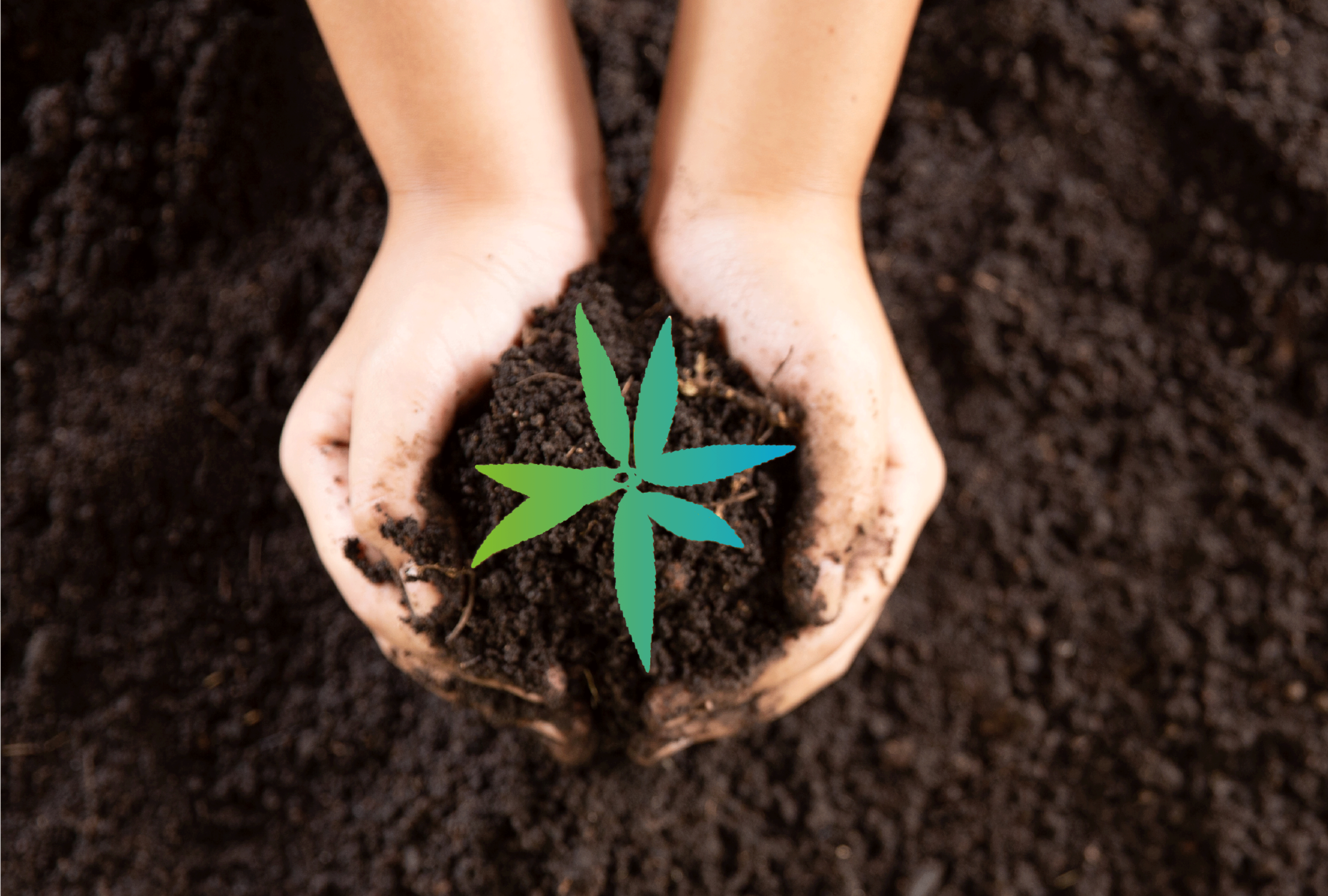
The gradient can be used to highlight an element in an image.
Gradient lines should take a maximum 1/8 of the given space. Multiple gradients should never appear on the same page, excluding the logo.
Things to avoid - Gradient
Don’t flip the gradient.
Don’t use more than one gradient.
Don’t overuse the gradient on pictures.

Don’t apply the line more than 1/8 of the page.
Don’t alter the position of the color within the gradient.
Don’t add a drop shadow to the energy line.

Don’t alter the colors within the gradient.
Don’t obstruct key elements of the image.